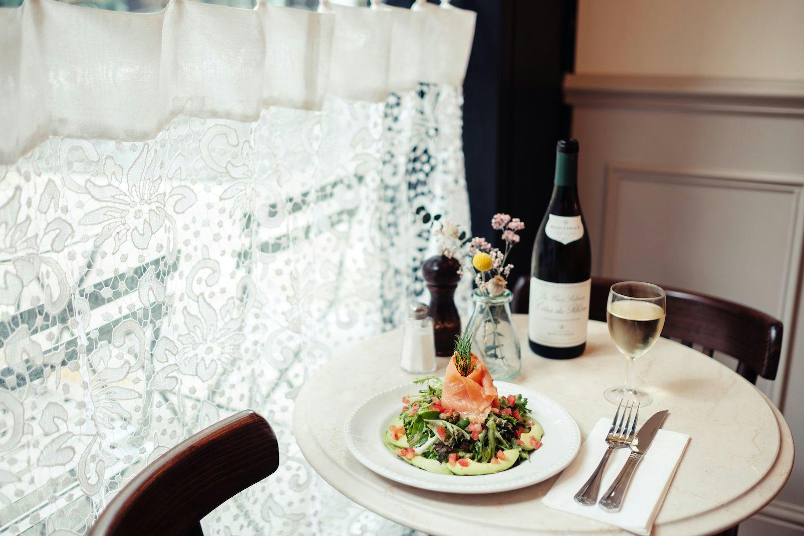
The brand aims itself at those interested with French cuisine and those who were looking for a nostalgic dining experience.
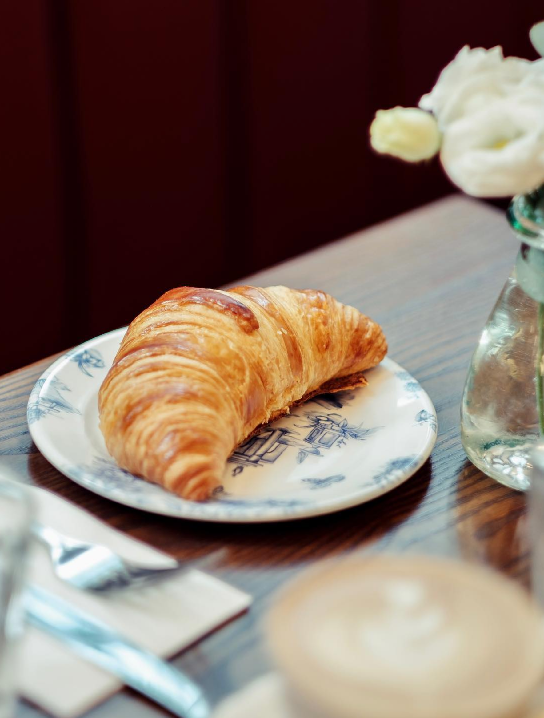
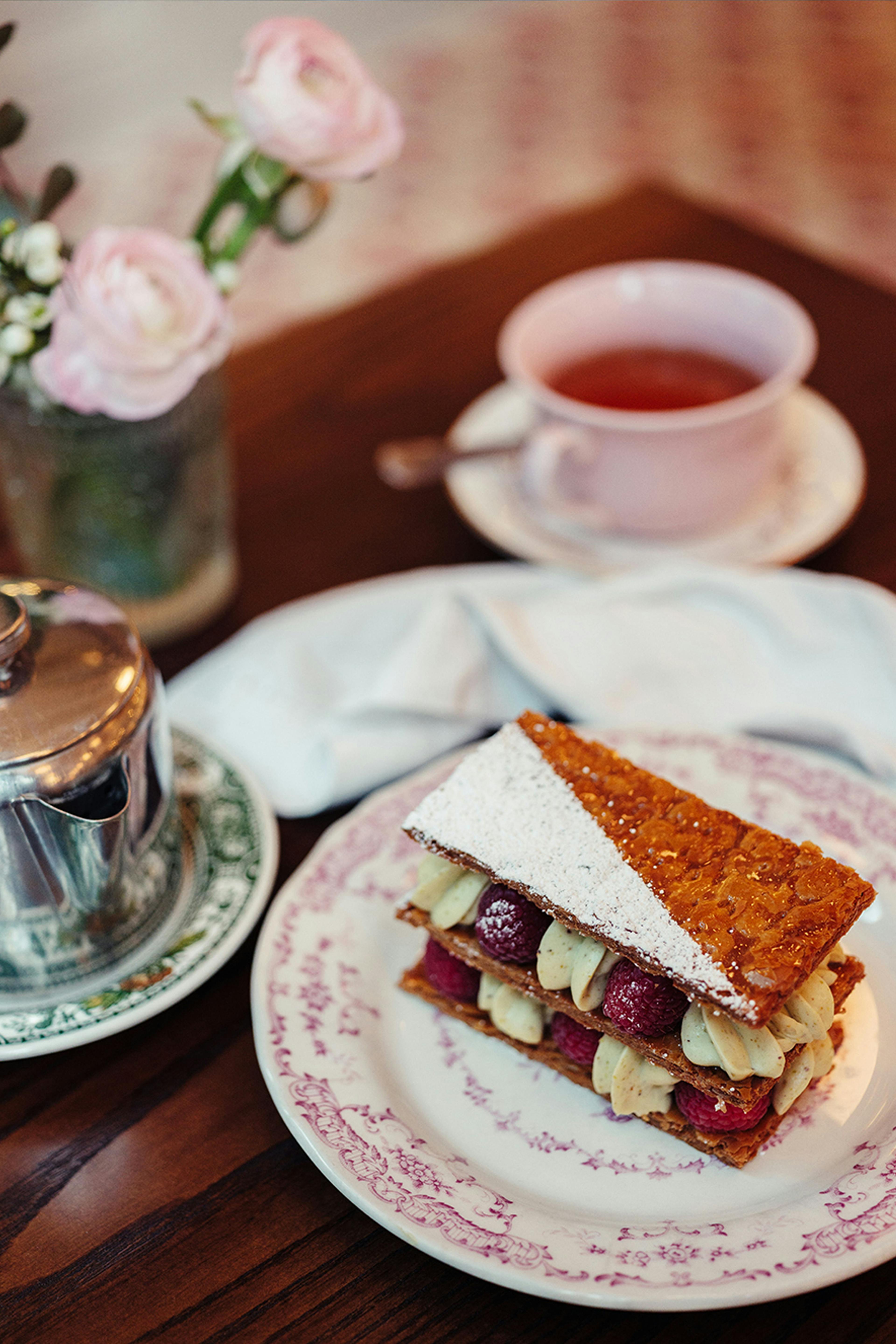
With Chez Antoinette, Aurelia (the owner) wanted to recreate her childhood memories, when her grandmother used to prepare delicious food in her kitchen. The new aesthetic needed to convey an authentic, nostalgic and non-cliche experience for guests.
We worked closely with Aurélia in recreating the childhood memories she has of preparing dishes with her grandmother. The new aesthetic is needed to convey an authentic, nostalgic, and non-clichéexperience for guests.
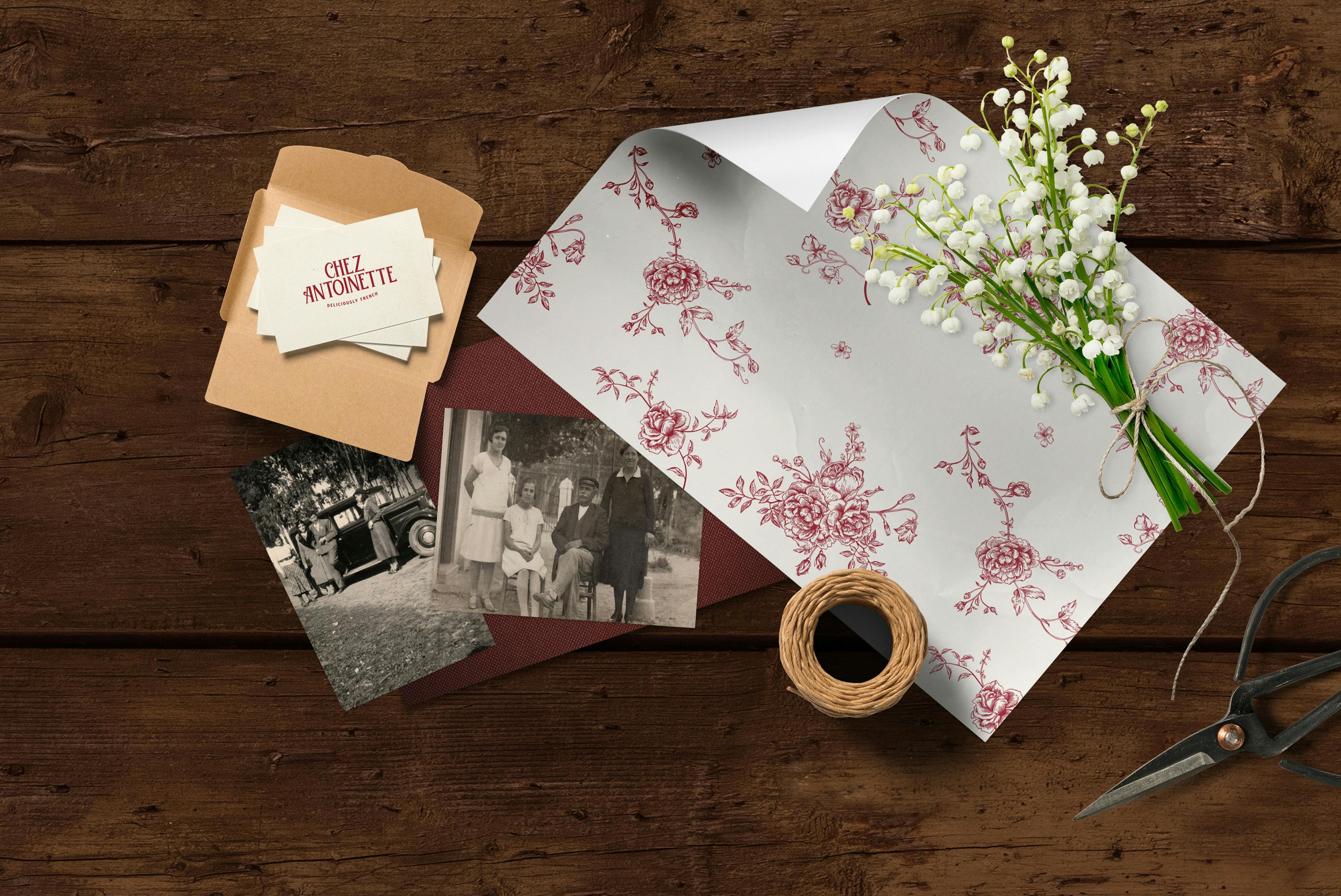
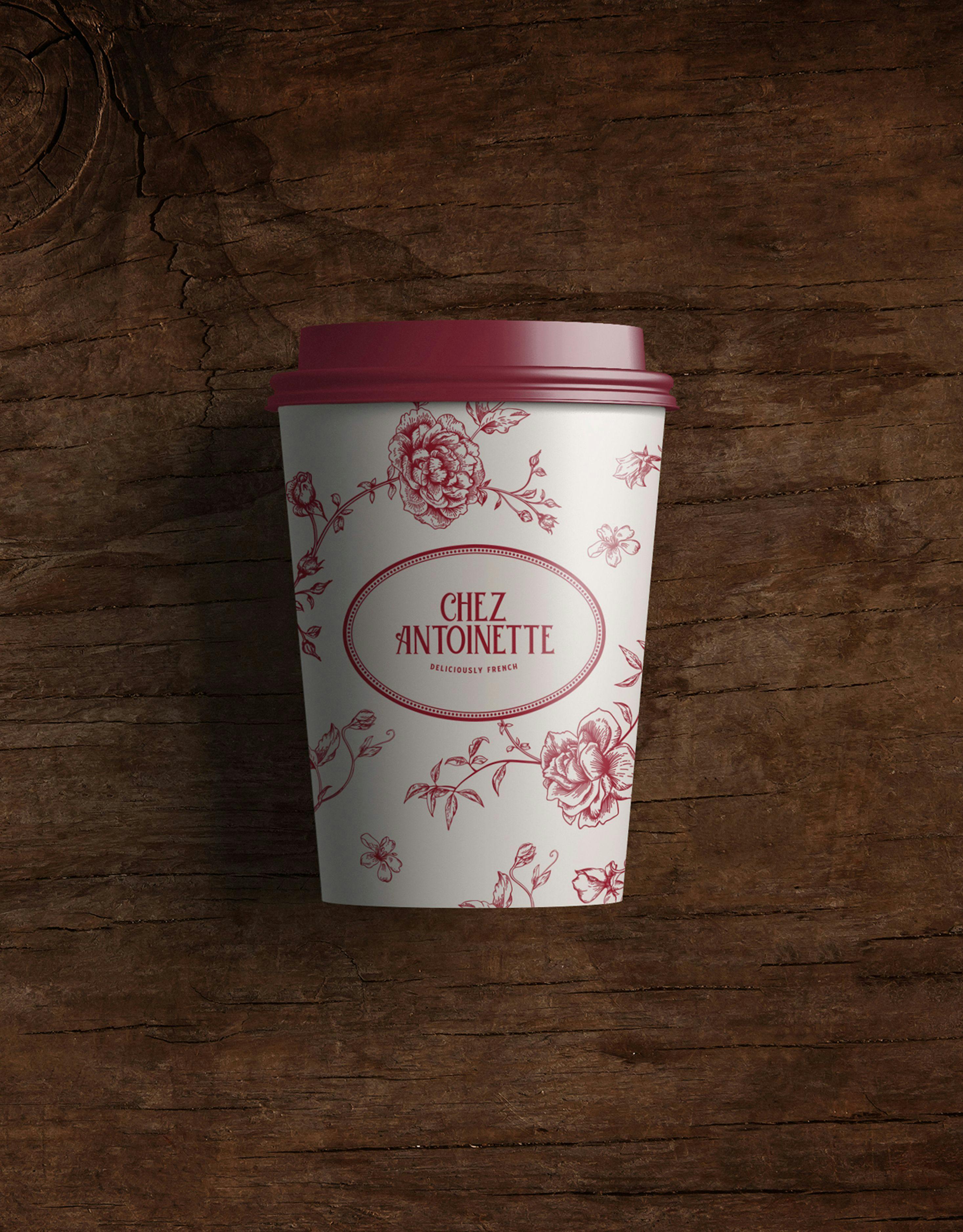
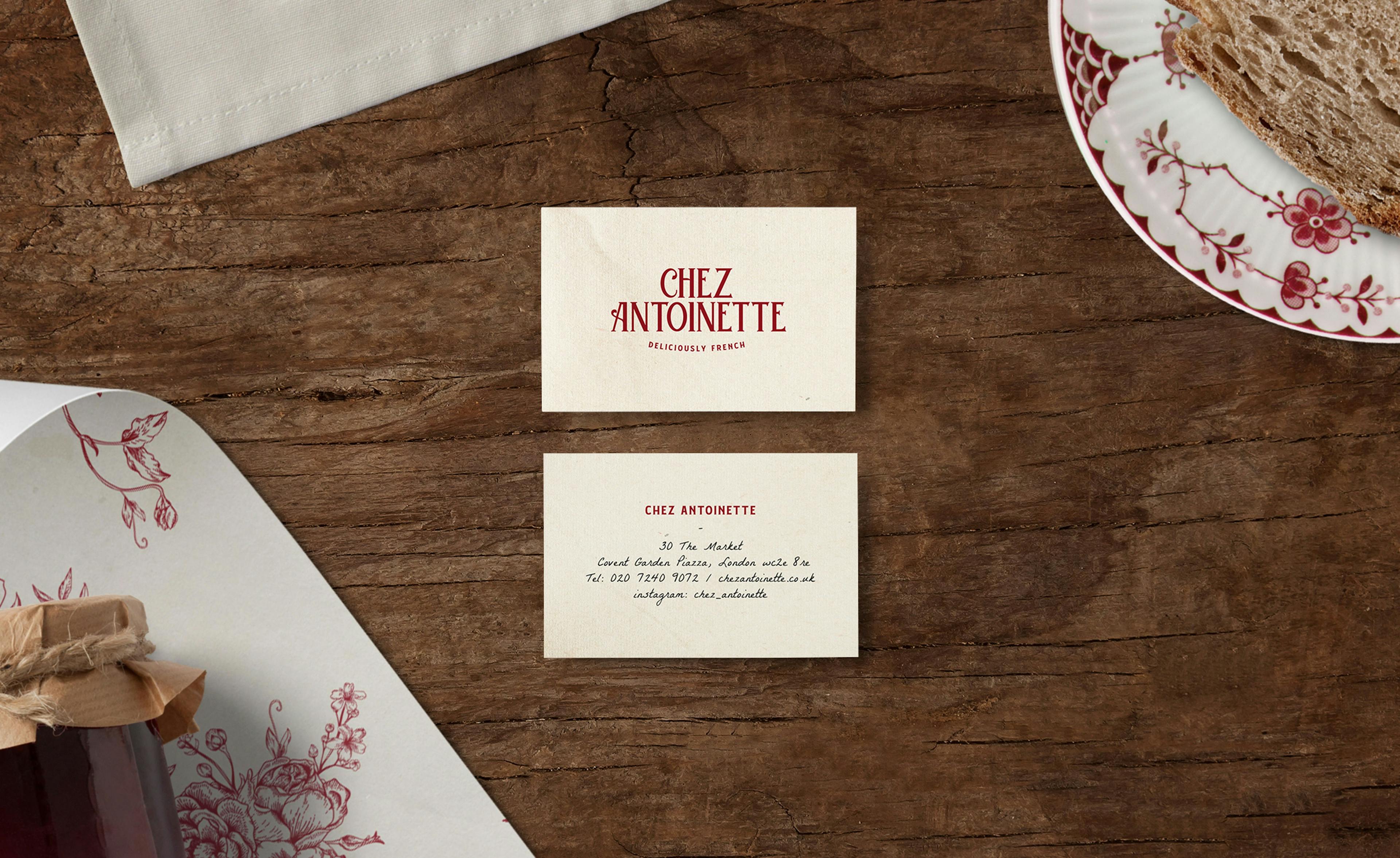
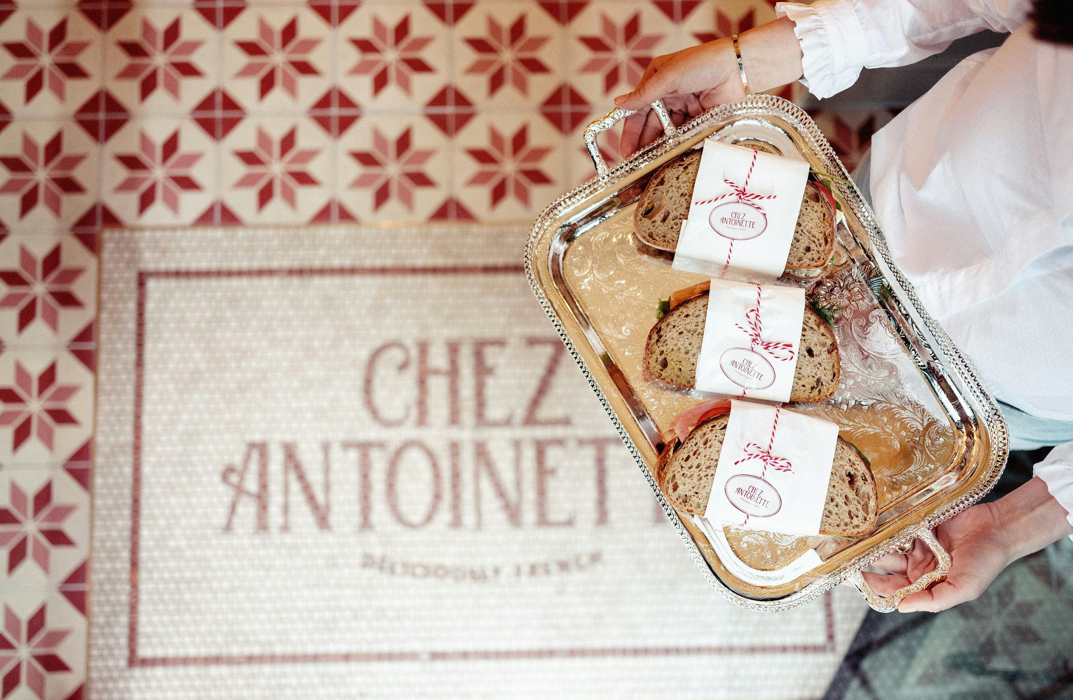
The concept evolves around a traditional French dining experience. We created the new brand concept and the brand elements such as typography,colours, packaging, logotype, and logomark.
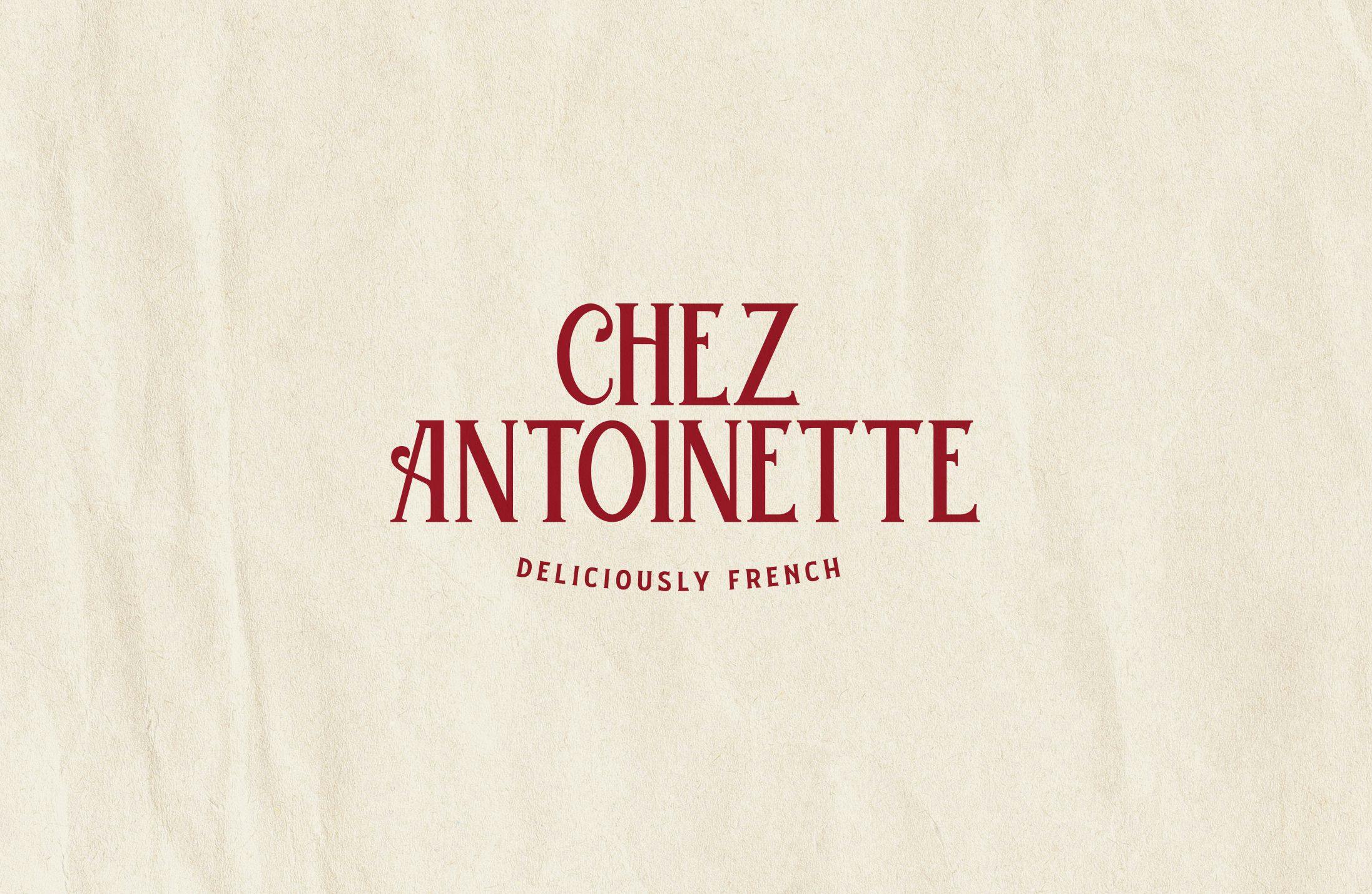
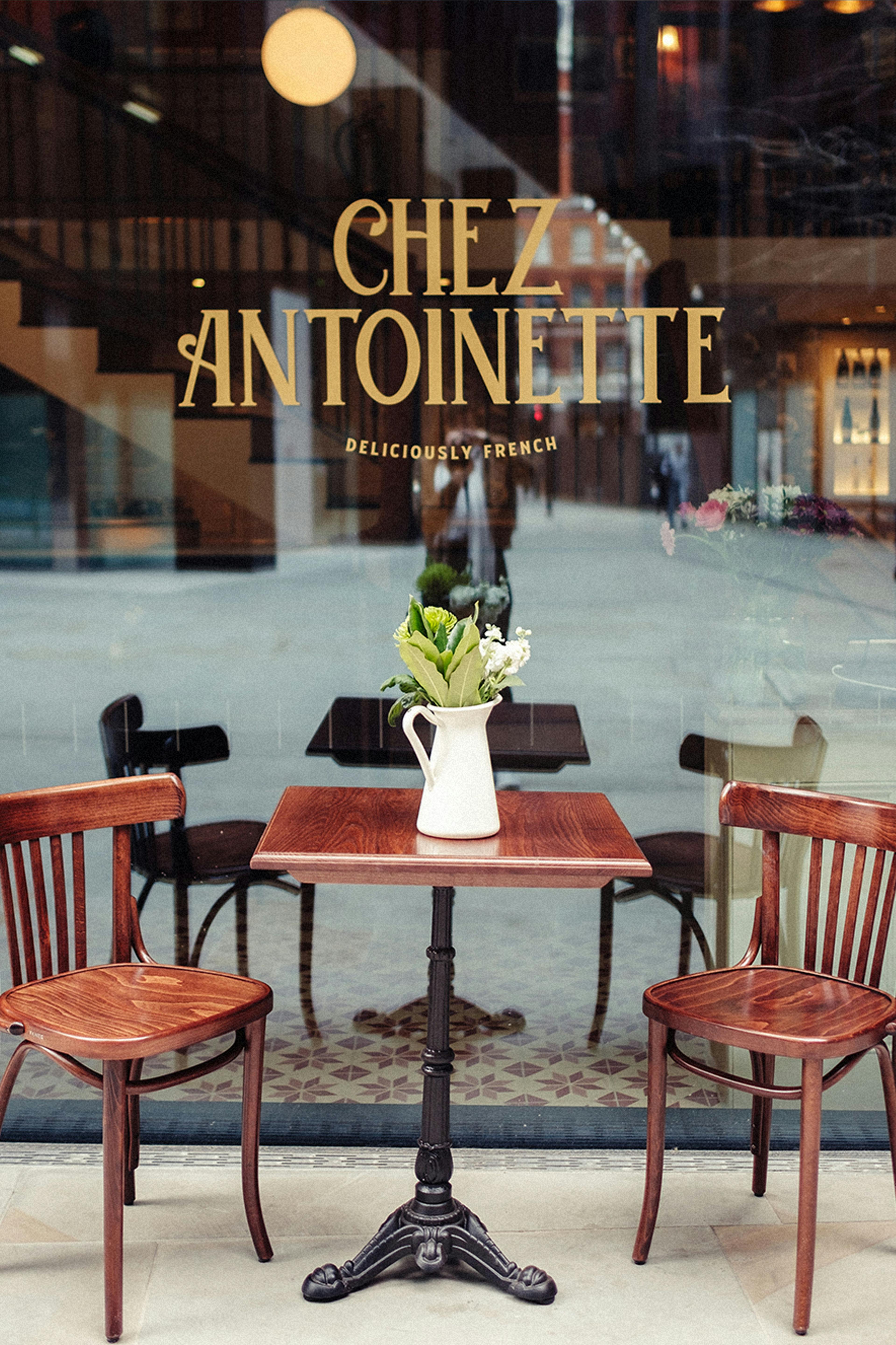
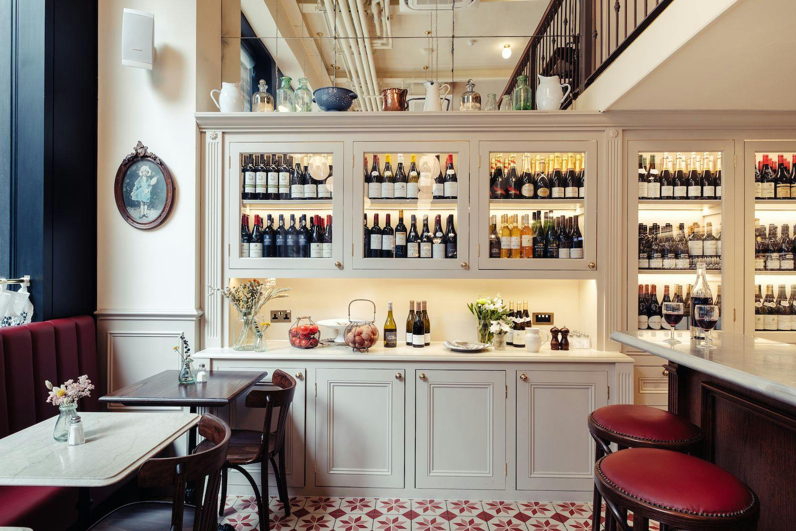
Our research into French packaging, signage, and home goods brought us back to the 1900s. Drawing direct inspiration from the stimuli we were able to design a bespoke logotype inspired by this era’sFrench lettering to give a nostalgic and authentic feel.
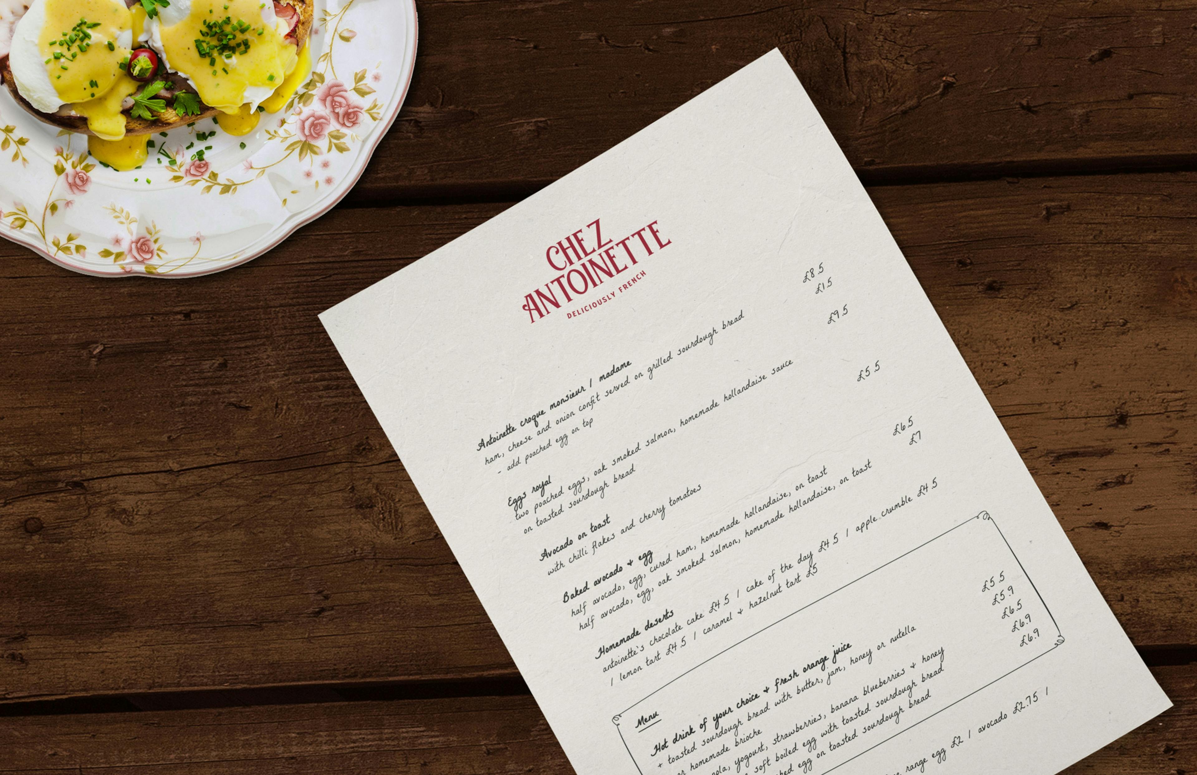
A new tagline was developed to give further understanding to the overall brand, providing a clear and concise brand image. Chez Antoinette’s new menu uses a typeface that imitates handwriting making it more personal and authentic.
The design had to be true to this strong heritage, easily identifiable and modern, in the respect of the traditional lettering & the authentic grandmother cuisine. Chez Antoinette is partway between the classic French café & the authentic family restaurant.
Our Role:
Photography:
Chio Fernandez