We designed a modern and playful visual system with both educational and technological sensibilities.
We were briefed to create an identity that has visual codes from both the finance and tech worlds to translate Nomica’s expertise and unique approach, without being locked into a rigid and corporate look and feel.
We designed a modern and playful visual system with both educational and technological sensibilities, shaping a sophisticated brand identity that is equally premium and human.
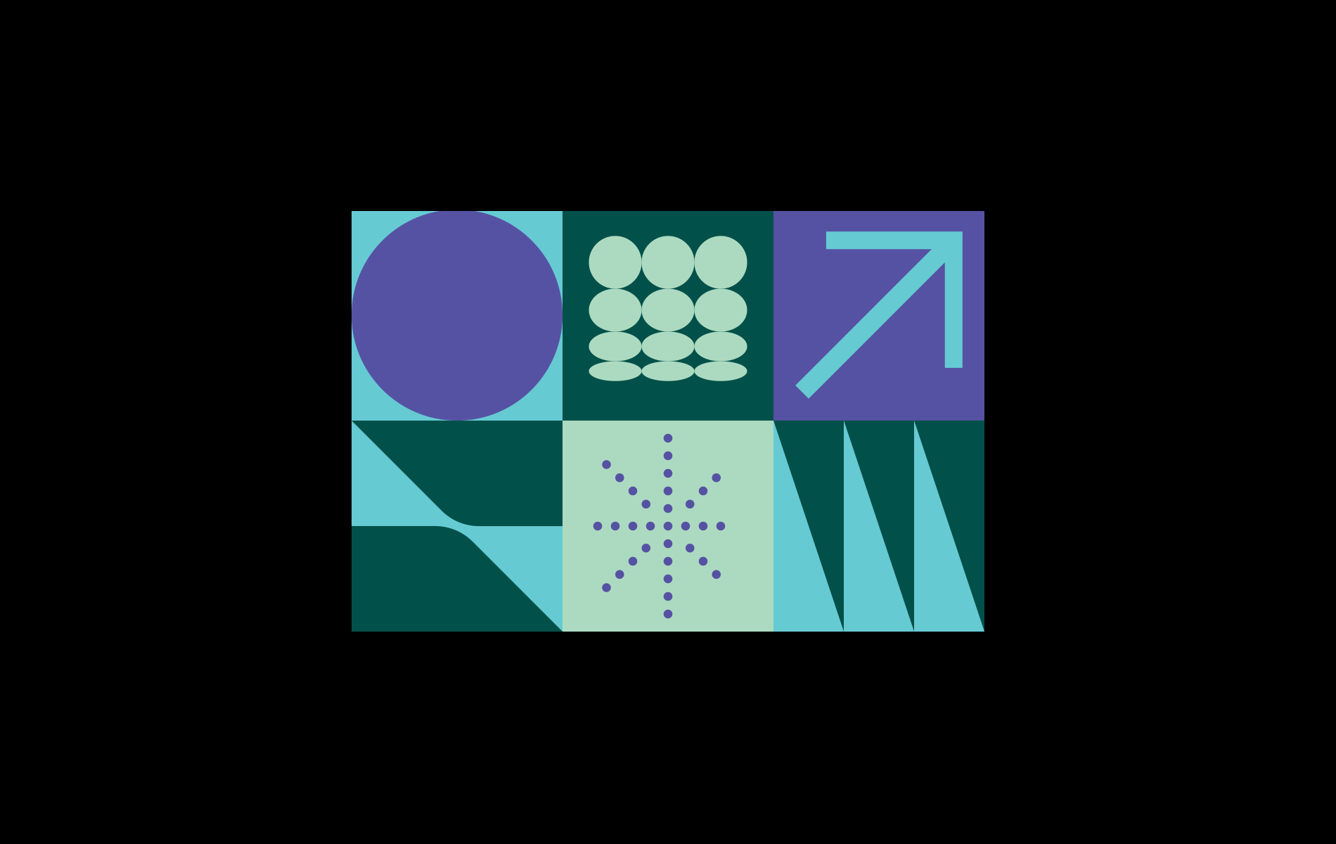
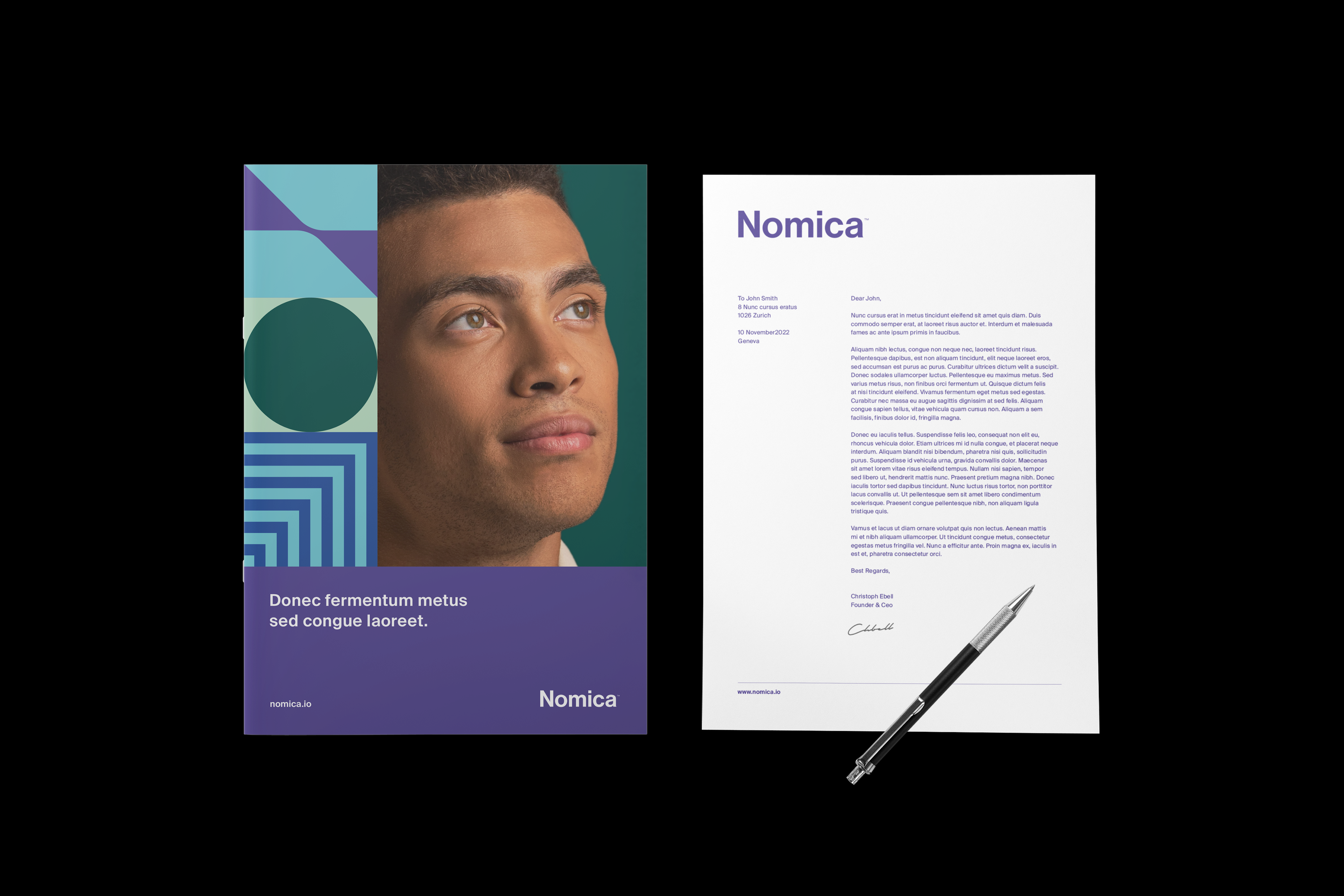
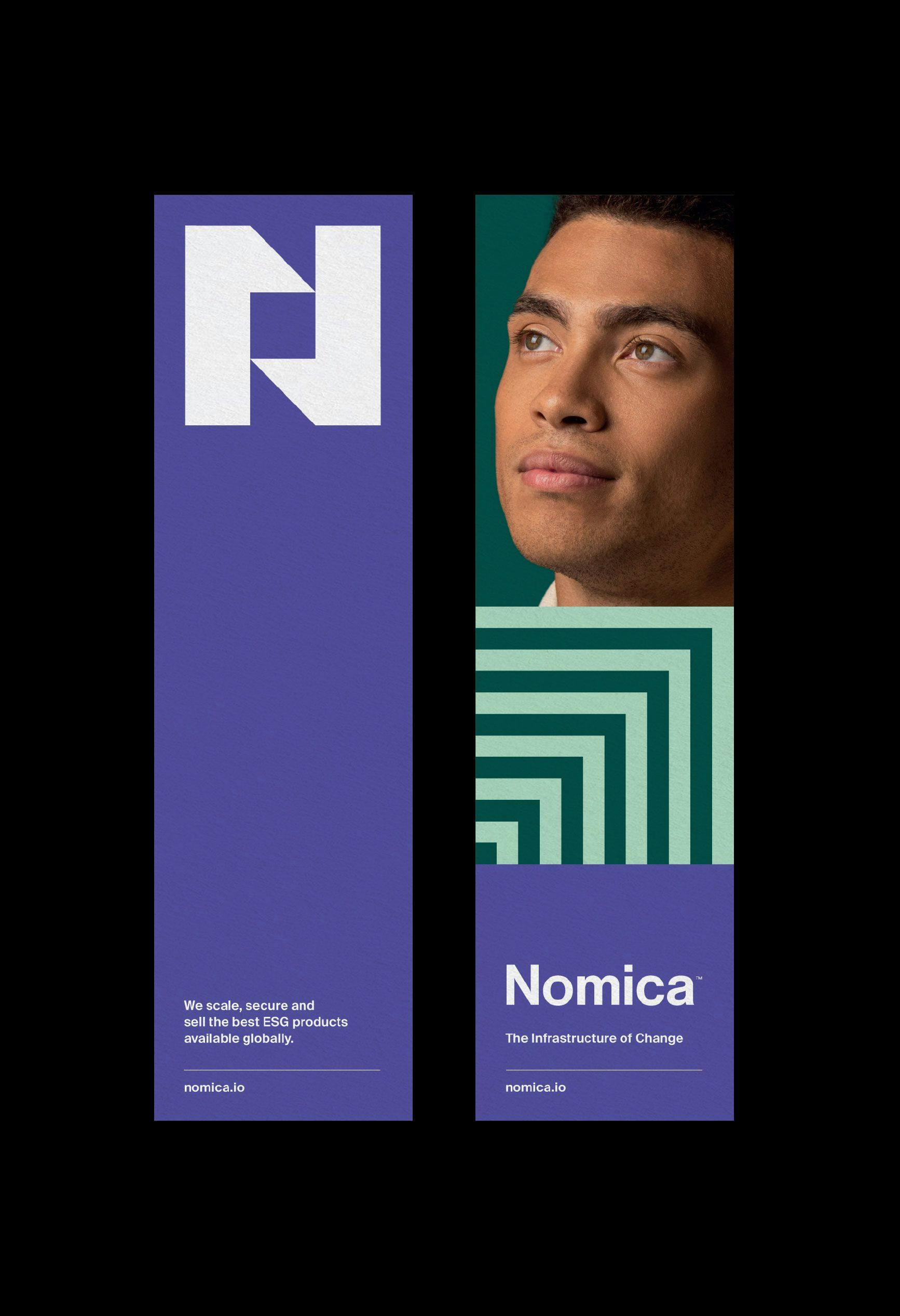
Nomica’s modular graphic system allows the brand to build a playful and expressive language through its media. This grid-based block system represents the company’s values and unique approach. We created an expressive colour palette that uses a range of shades referring to Earth, Nature, and Technology, shaping a vibrant and contemporary look & feel, that plays a central part in Nomica’s visual system.
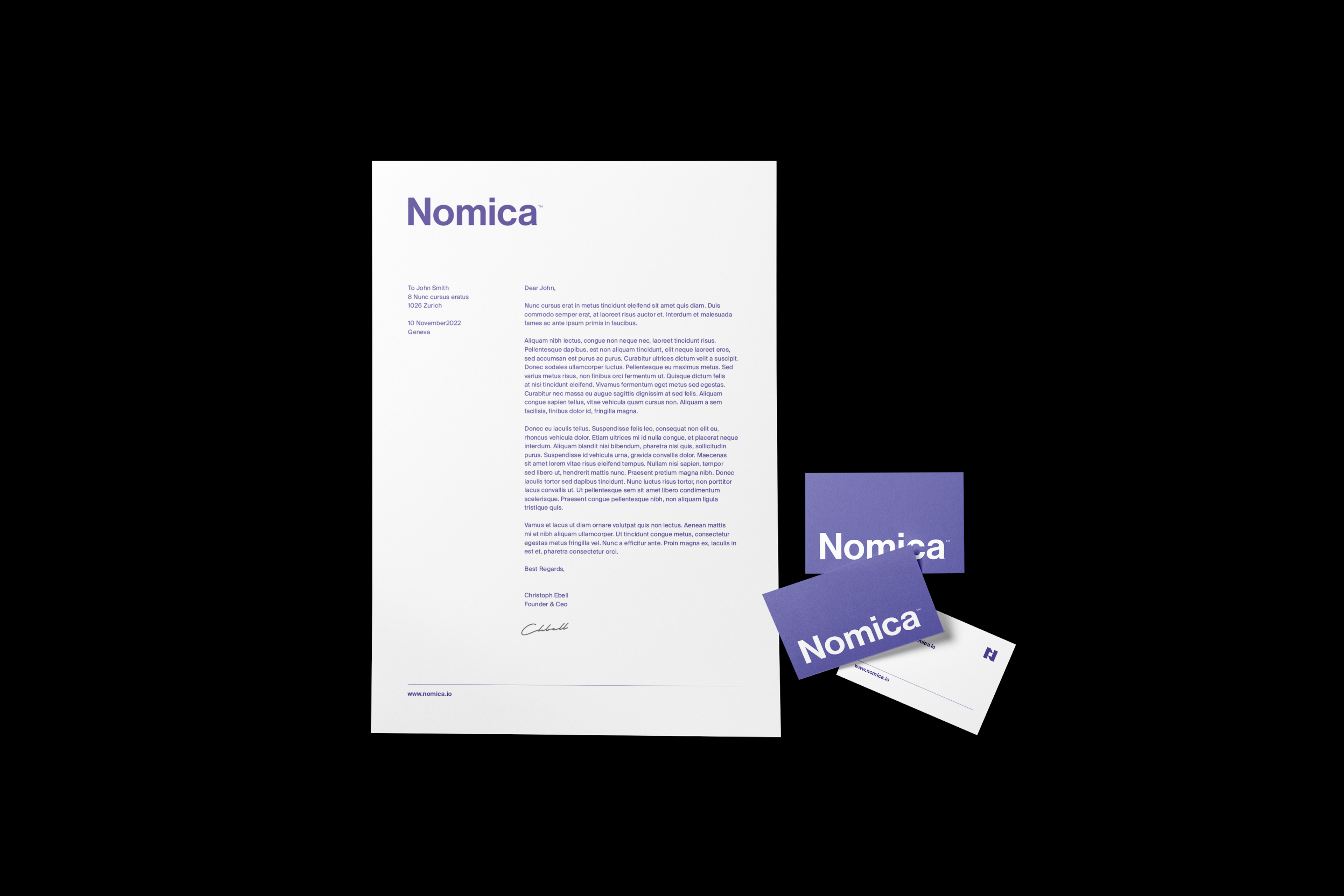
Nomica’s logotype is a sophisticated logo with an organic aesthetic, inspired by beautiful Swiss typefaces. The logomark is a modern and playful symbol based on the first letter “N” of the brand, using plain geometric shapes for a friendly, recognizable, and trustable look.
Our Role: