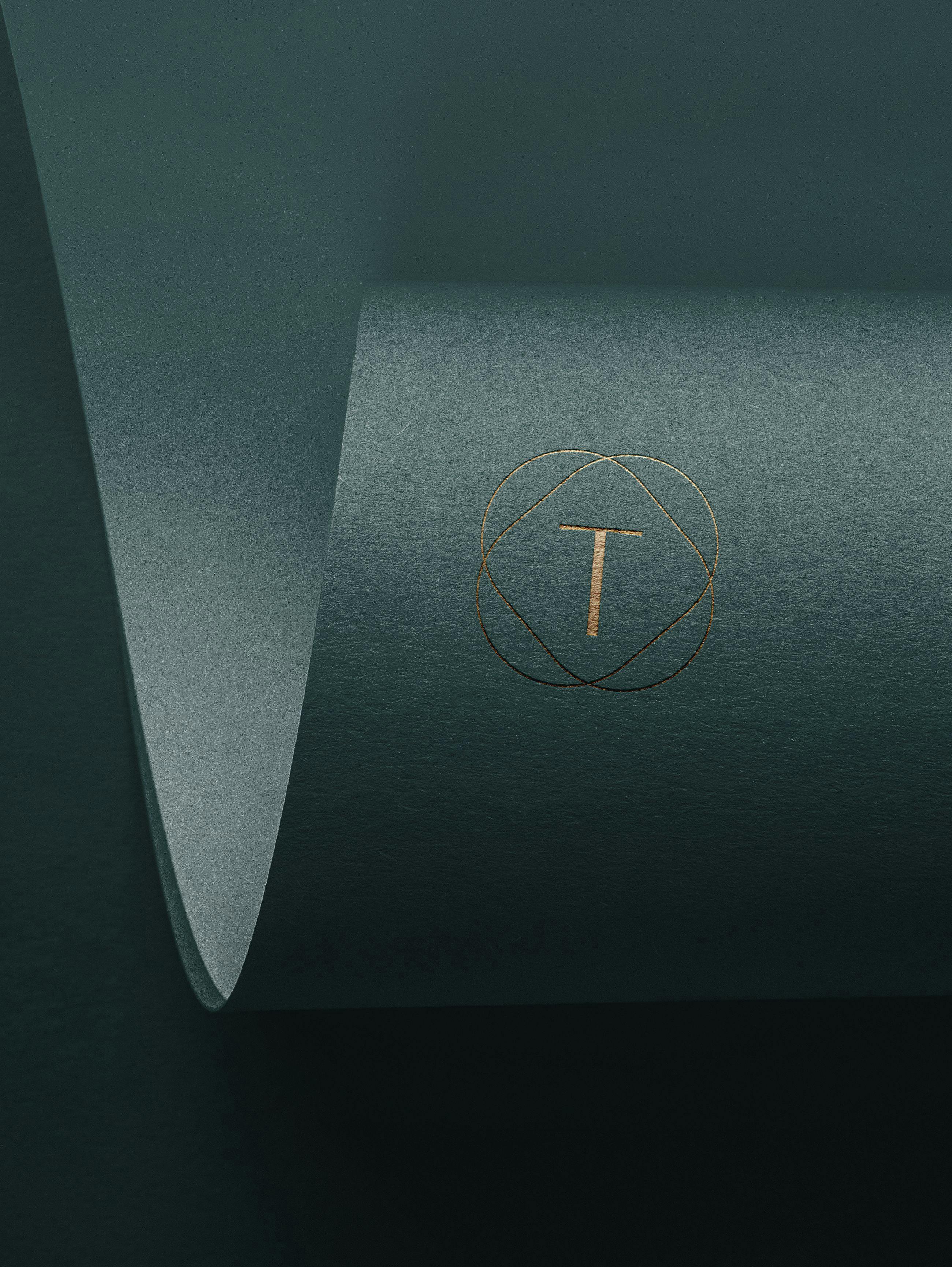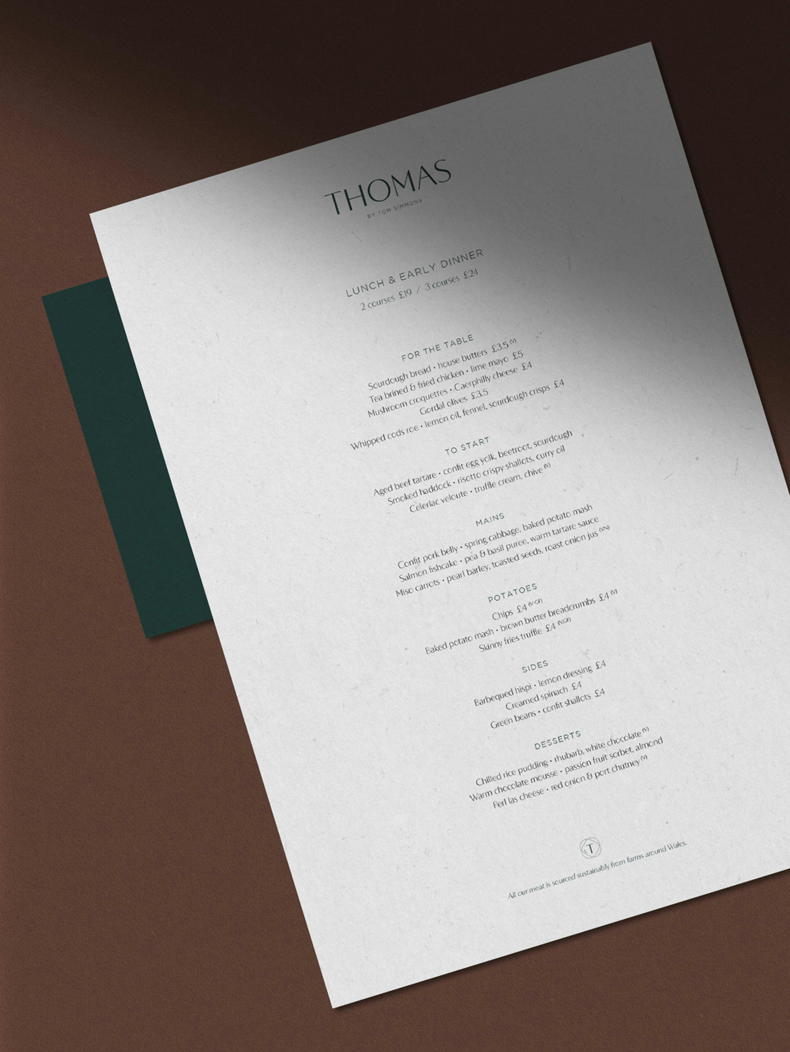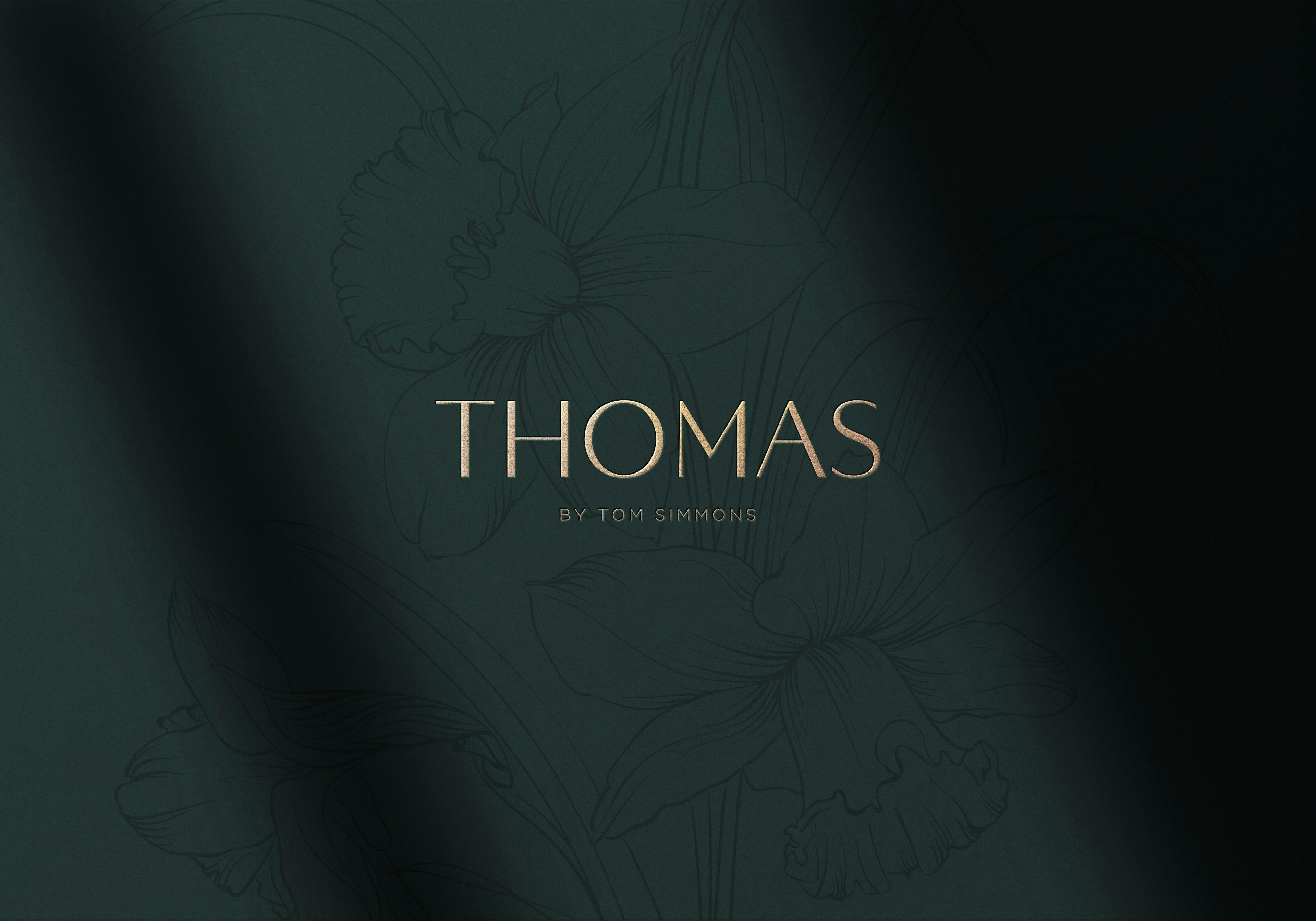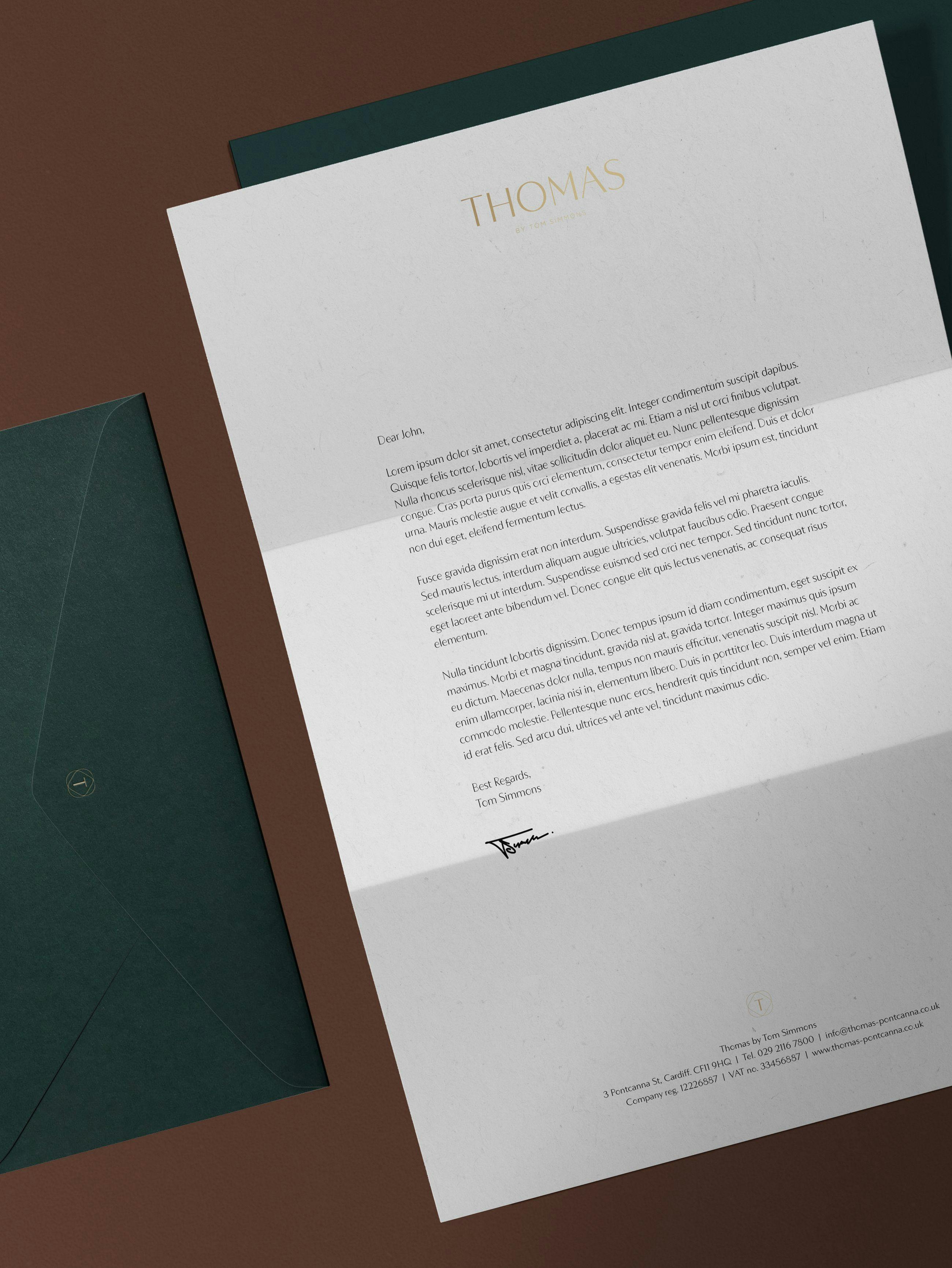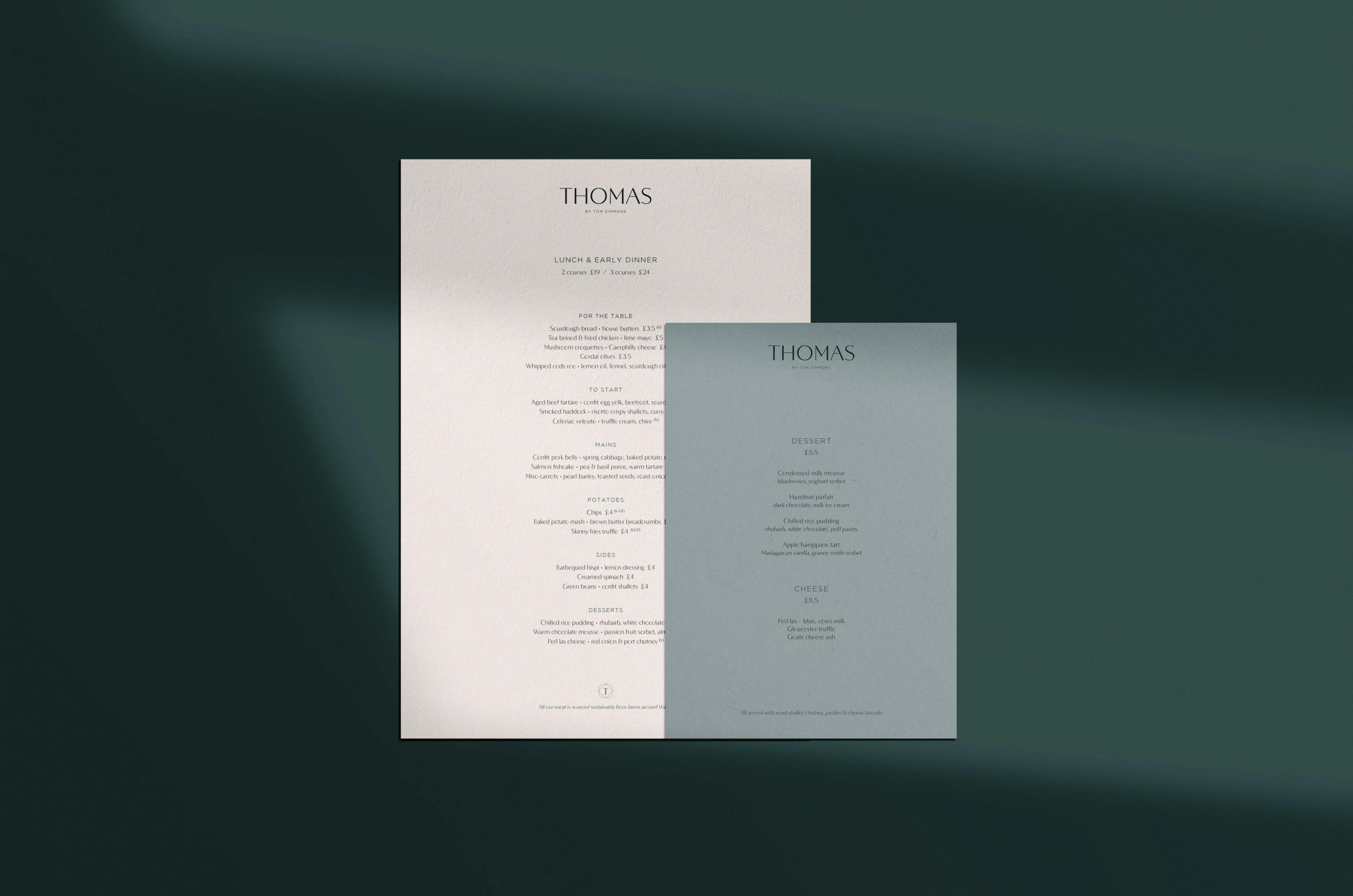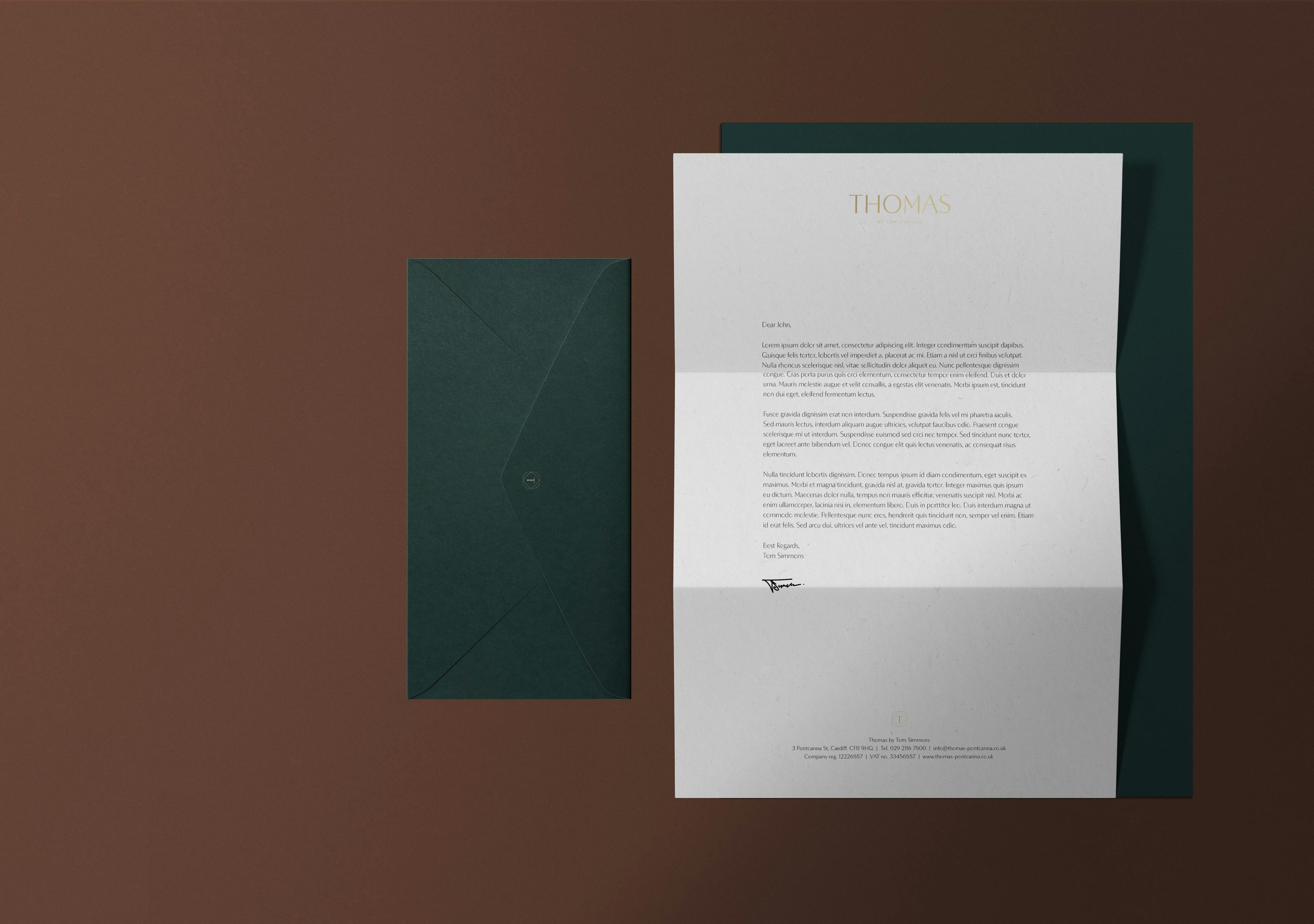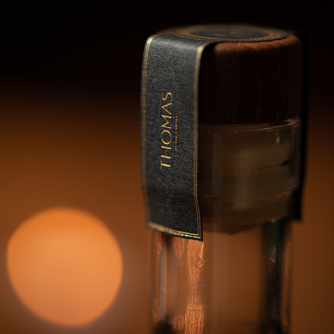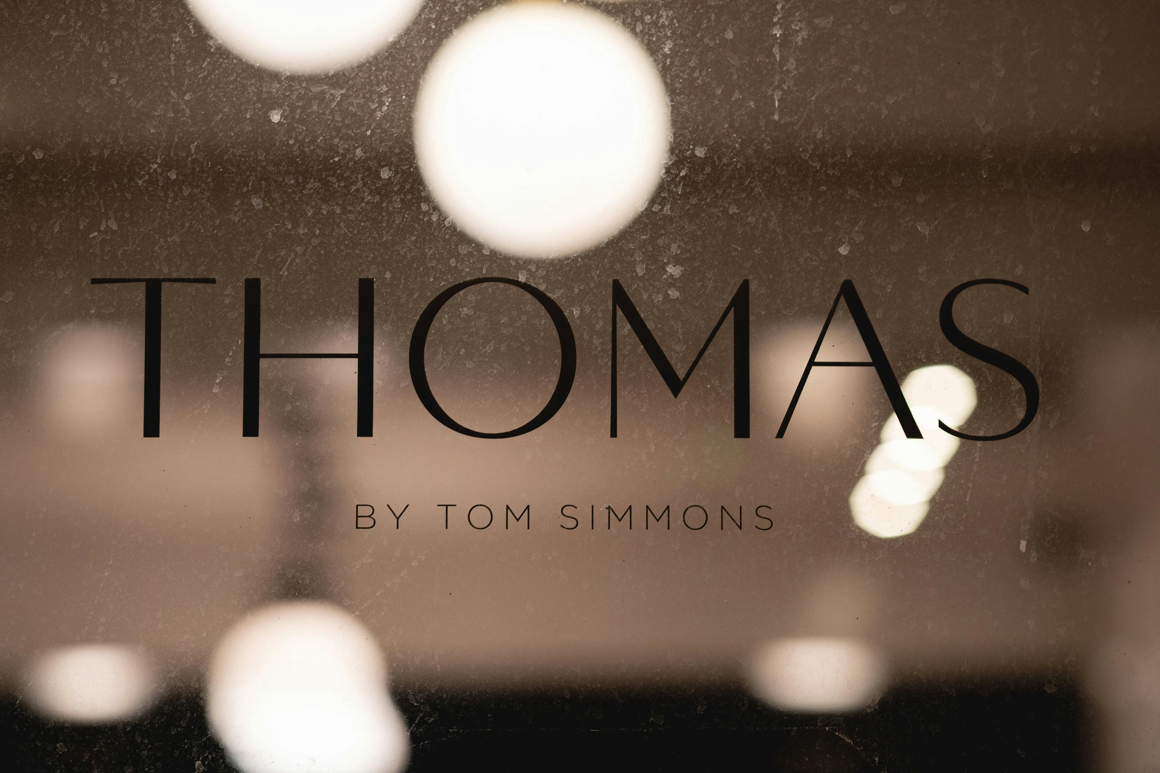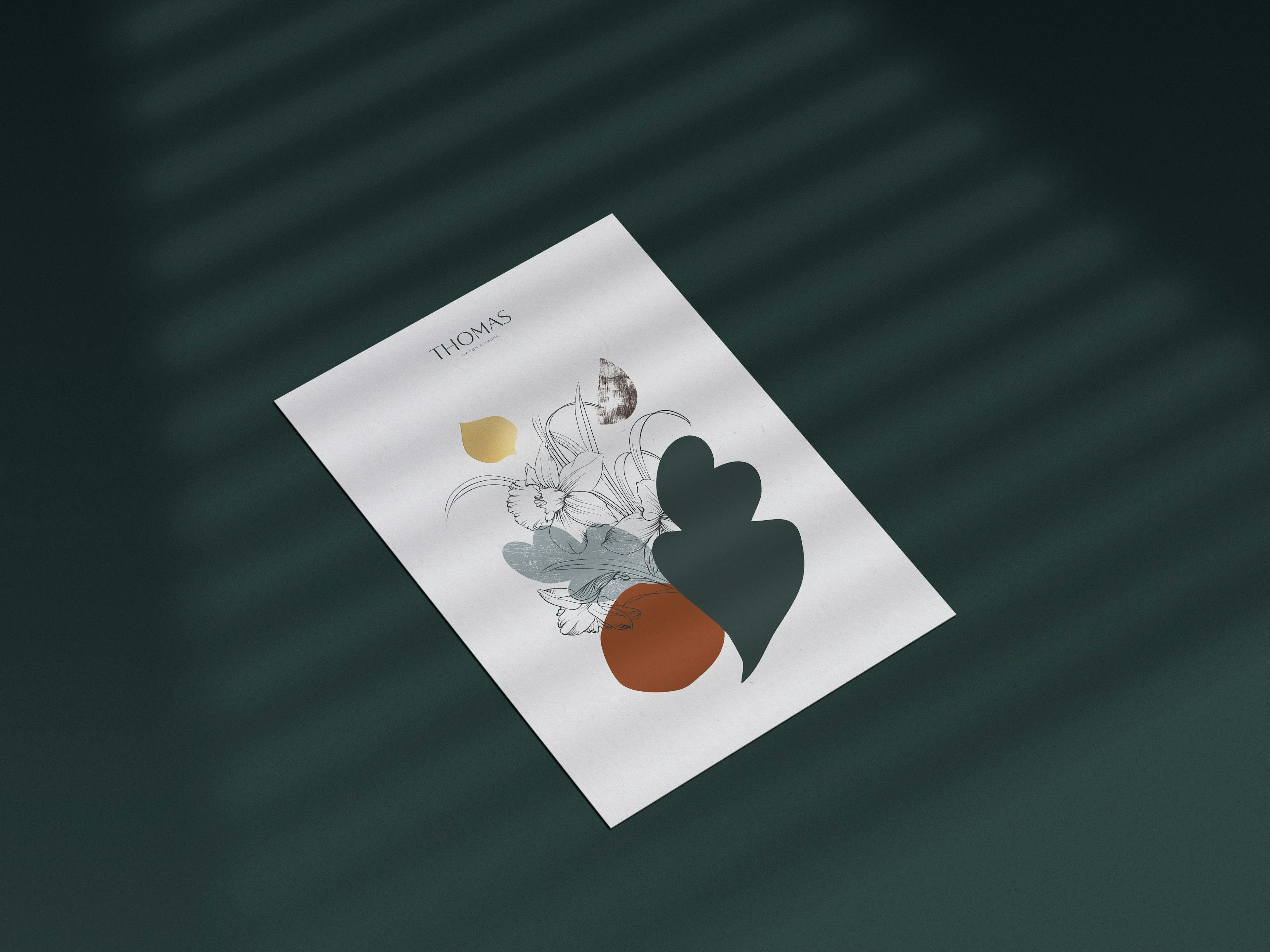
Thomas logotype has a custom typeface with the perfect balance between tapered stems and geometric thick/thin lines and a good dose of modernity into the design to give a subtle luxurious feel.
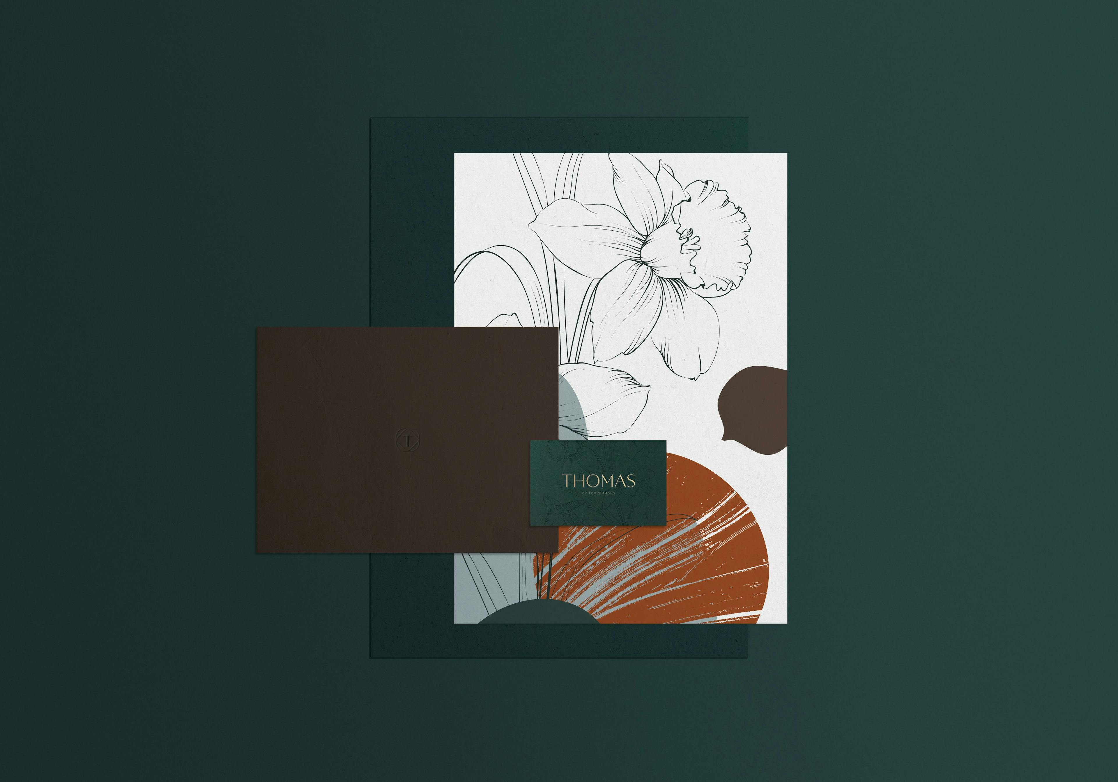
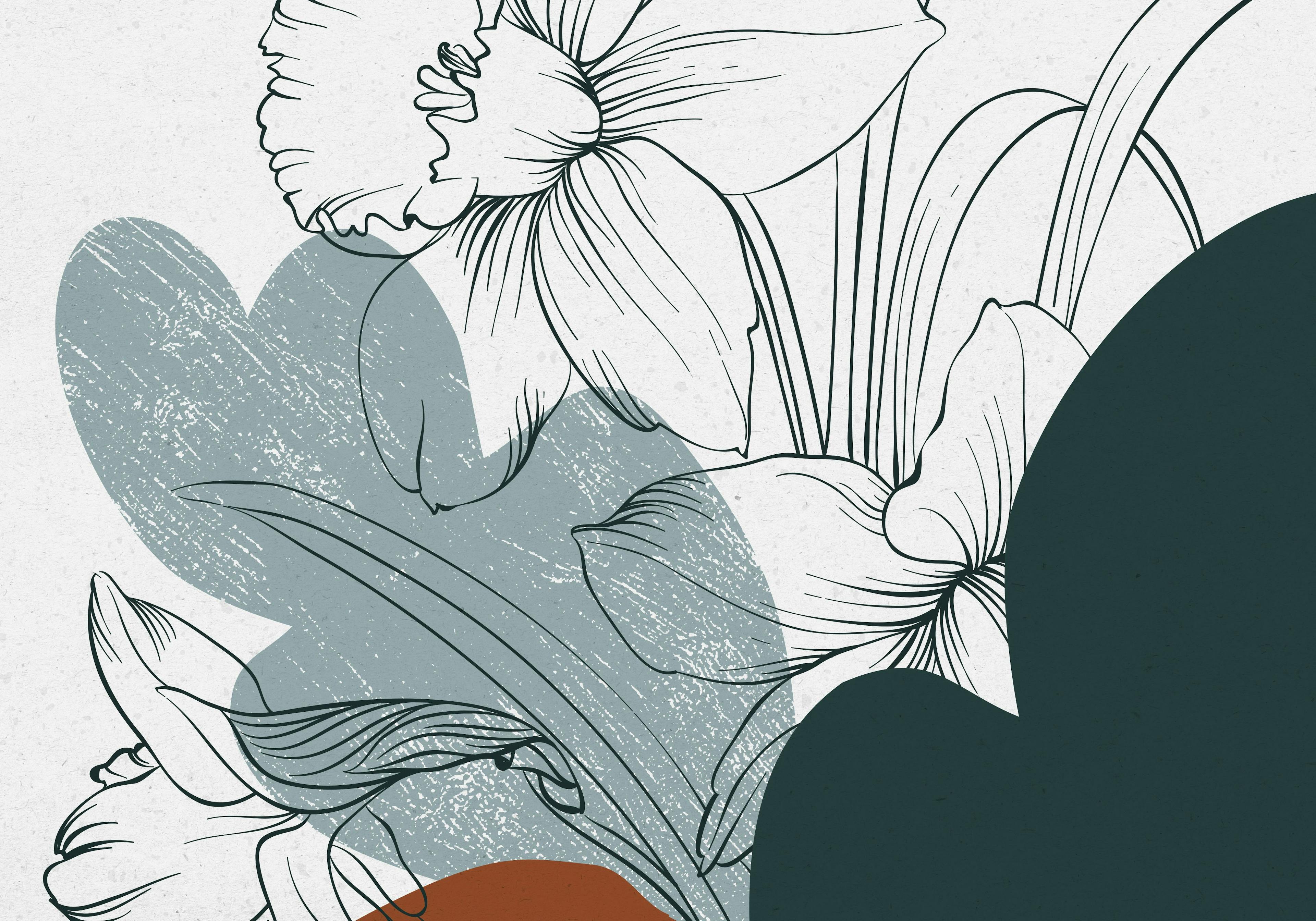
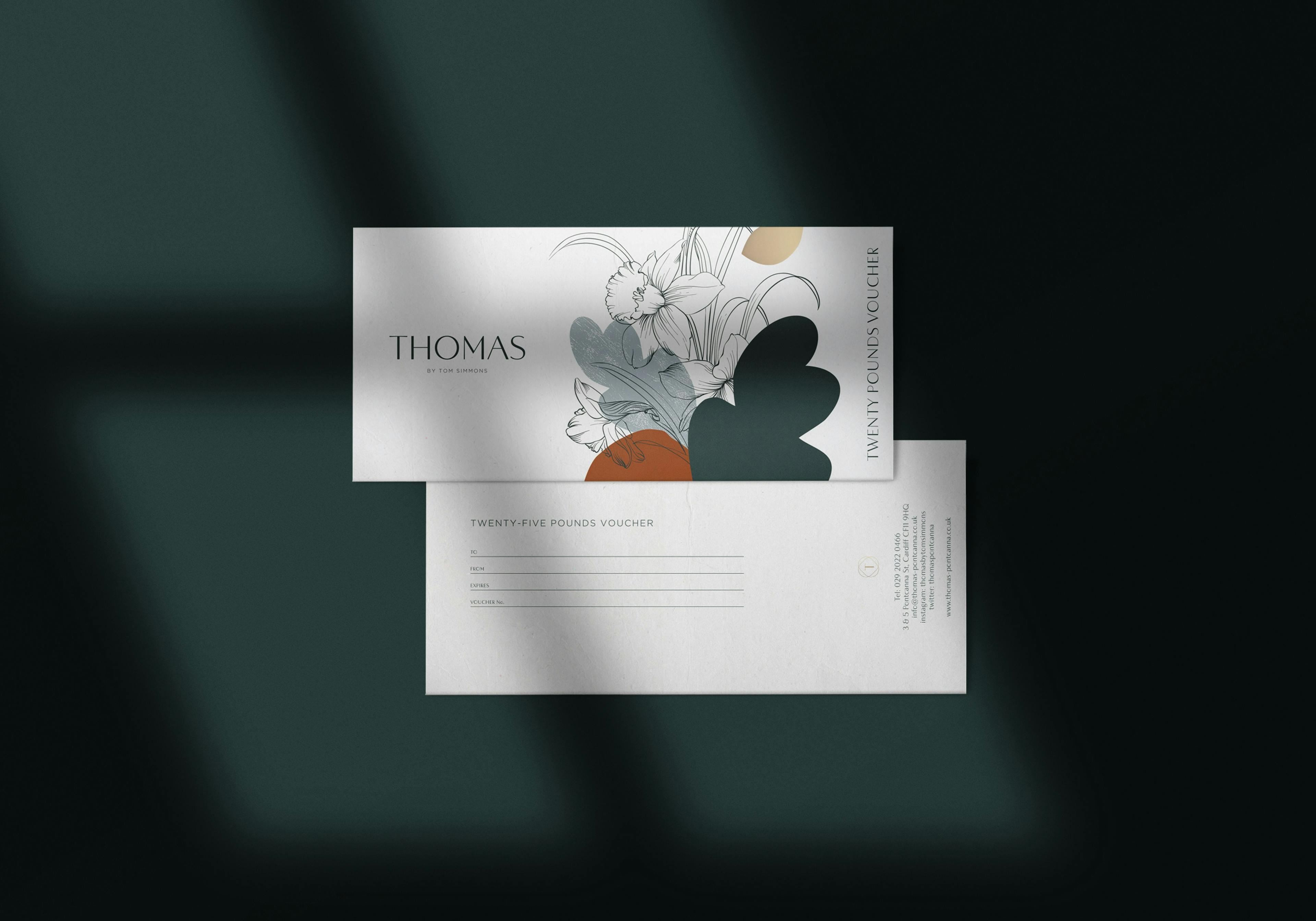
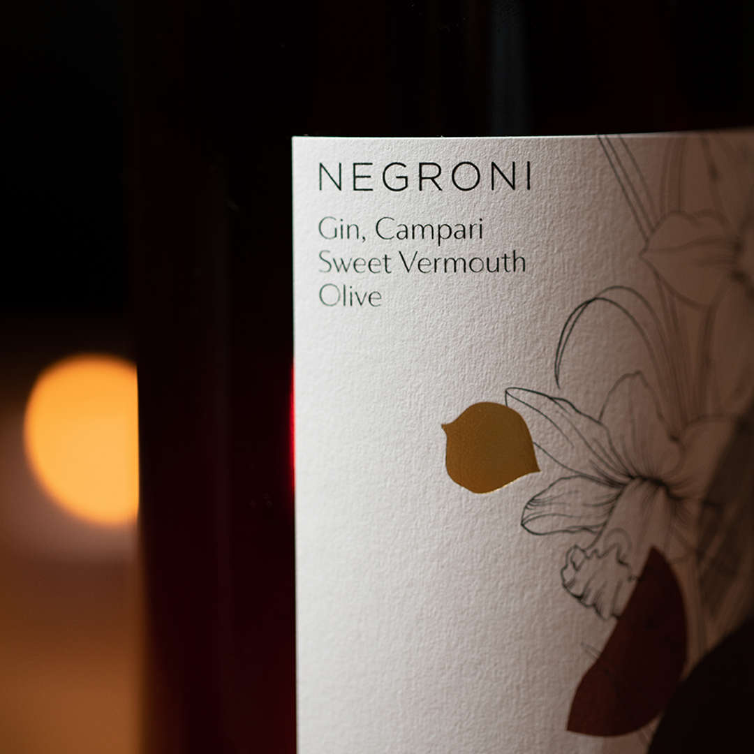
One of the main requests was to keep the “Tom Simmons-Tower Bridge” branding and the new “Thomas by Tom Simmons” consistent. As we previously incorporated the leek in the ‘Tom Simmons’ branding we decided to work around the daffodil which is one of the national symbols of Wales. Therefore, we created bespoke illustrations featuring shapes that evoke vegetables, strengthened by a gold foiling for a clean and elegant finish.
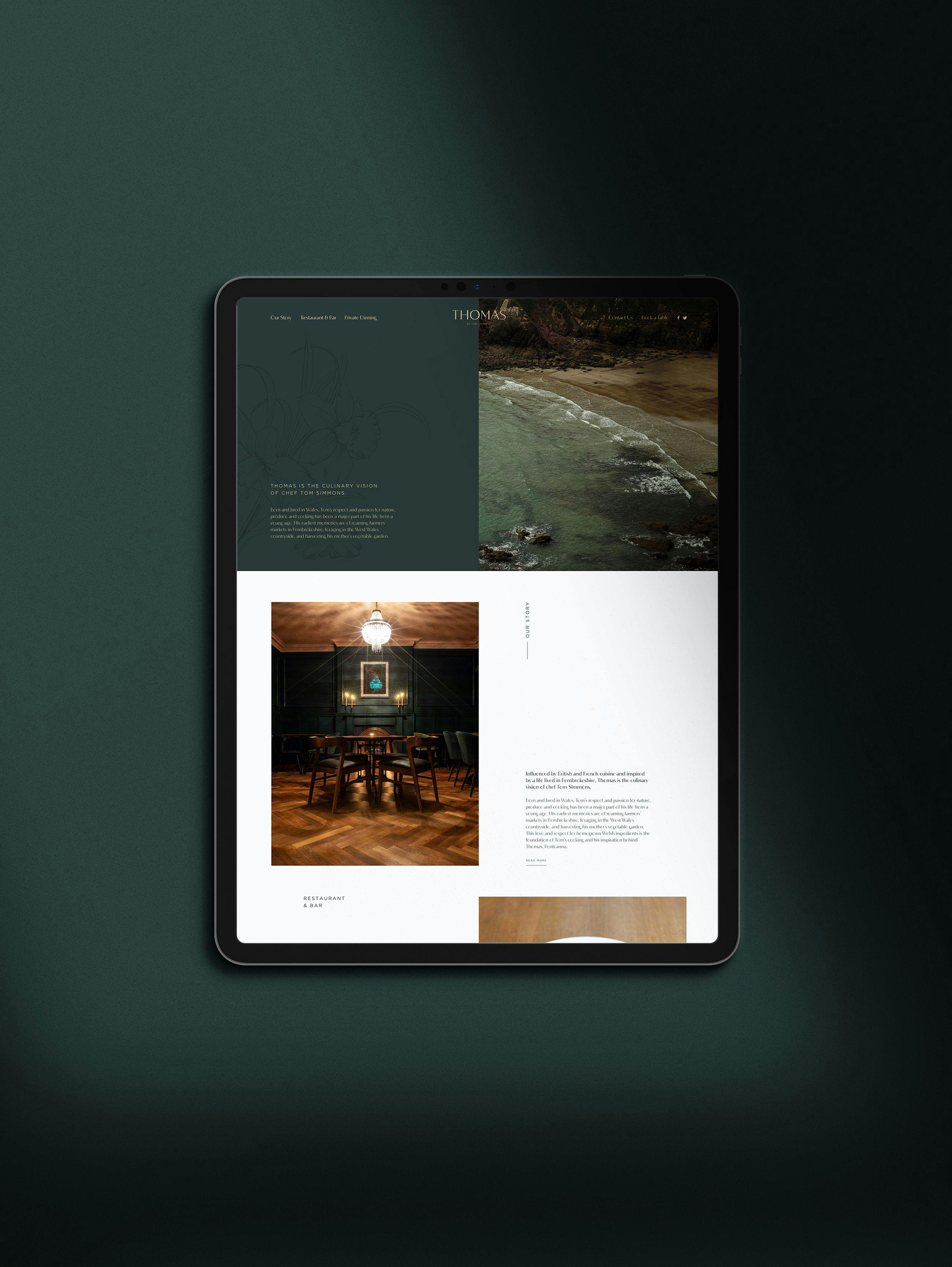
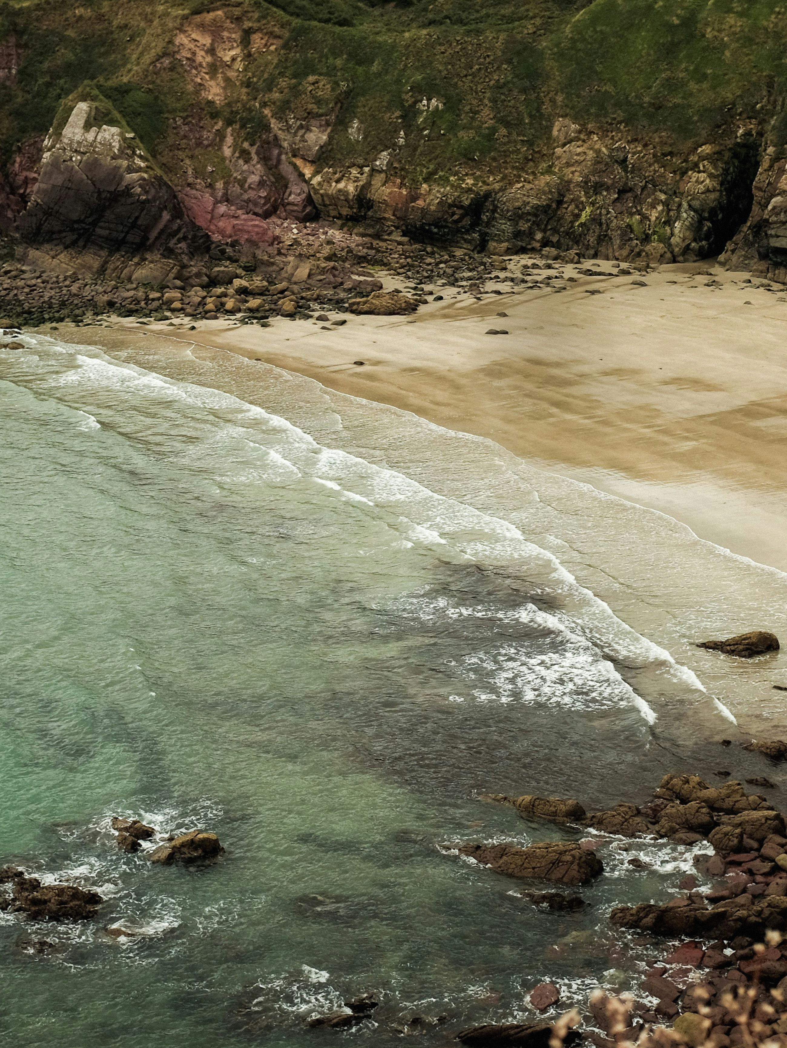
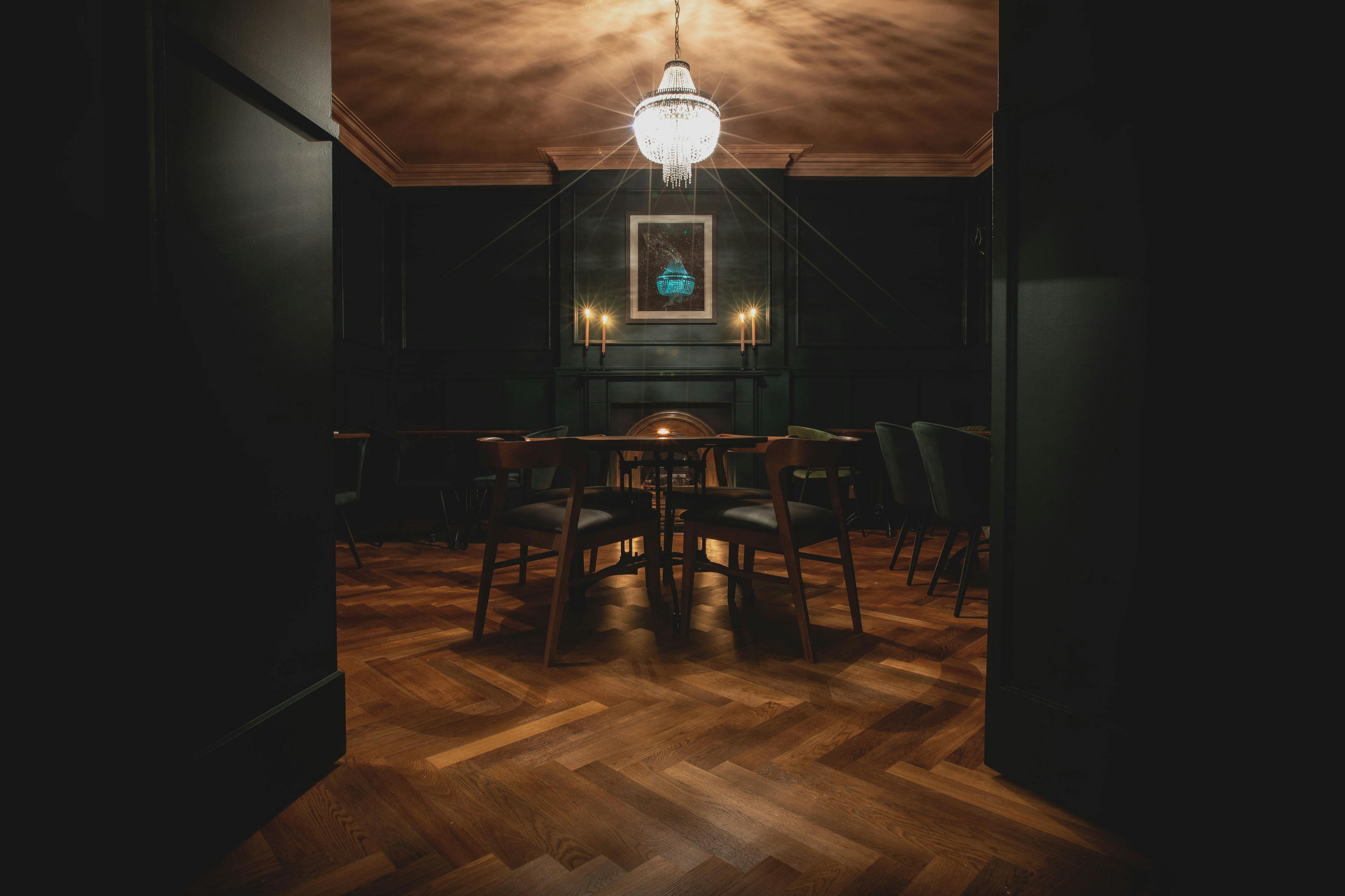
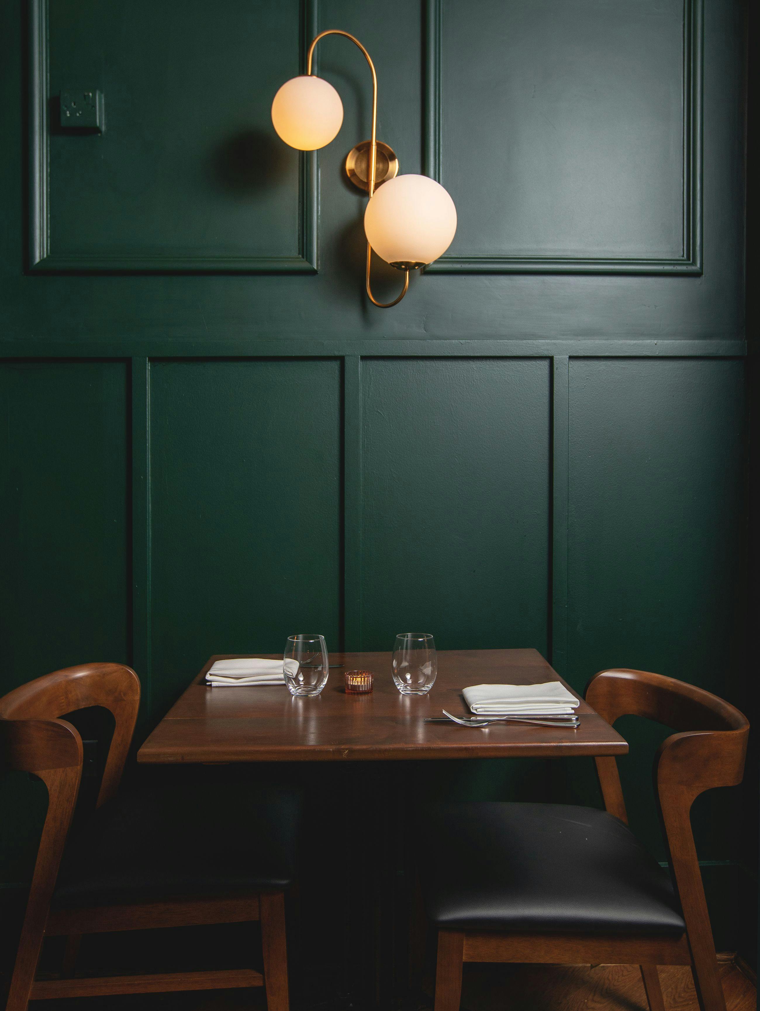
Thomas’s colour palette is inspired by Wales’s beautiful landscapes from the mountains to the sea. The brand identity pulls together the restaurant’s unique atmosphere and interior design: a diverse range of eclectic, reclaimed furniture and lighting, rich vibrant colours, and textured fabrics.
Our Role:
