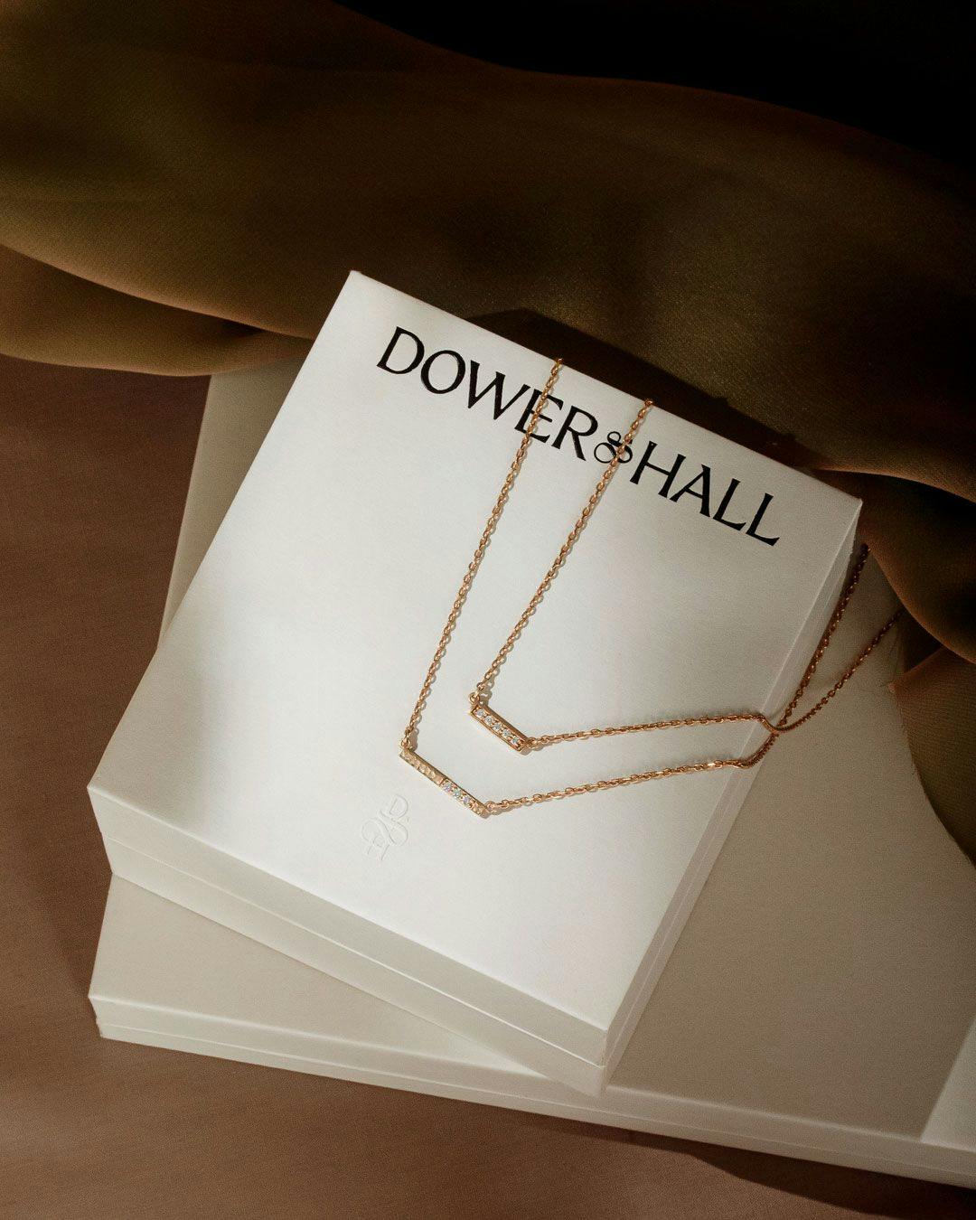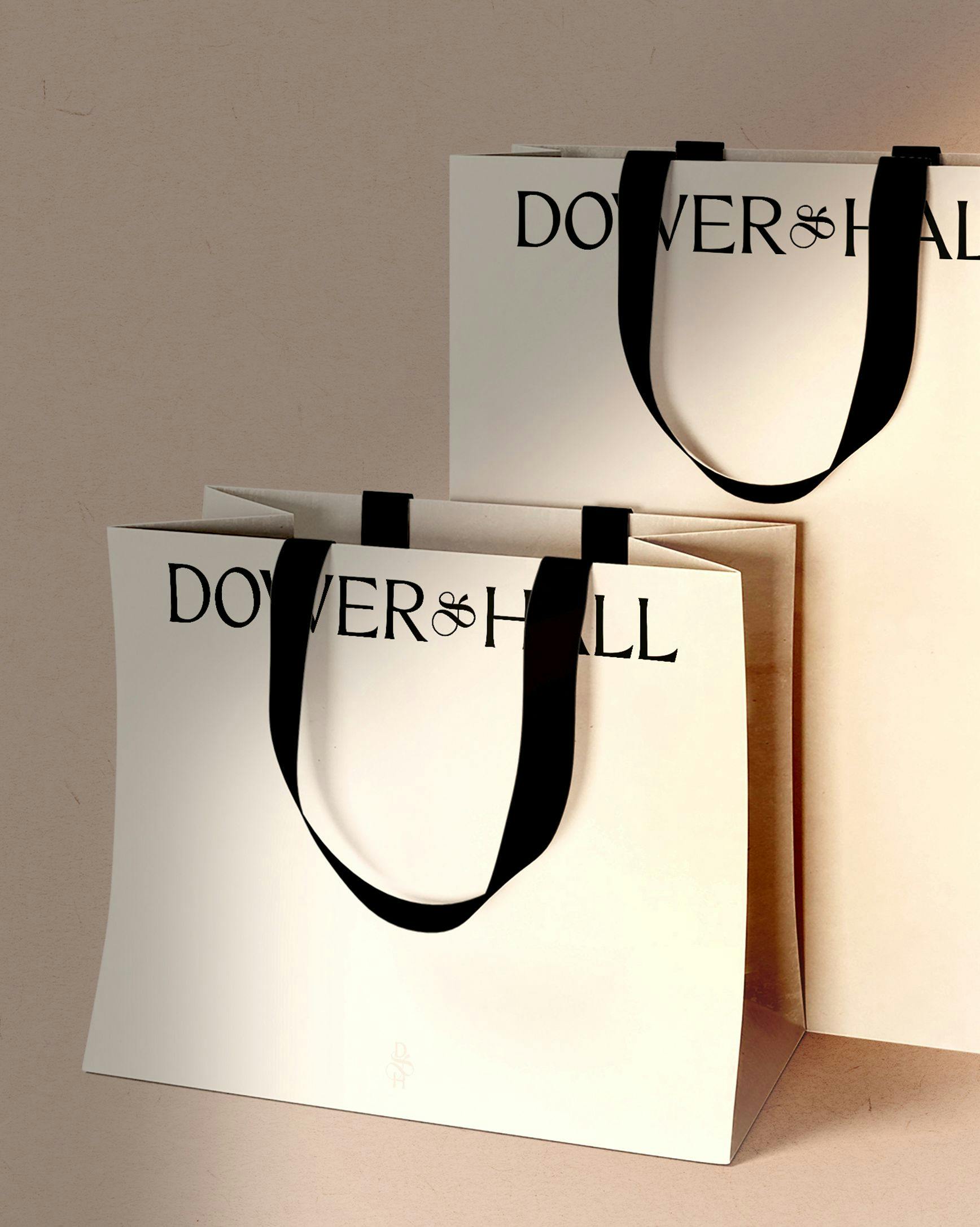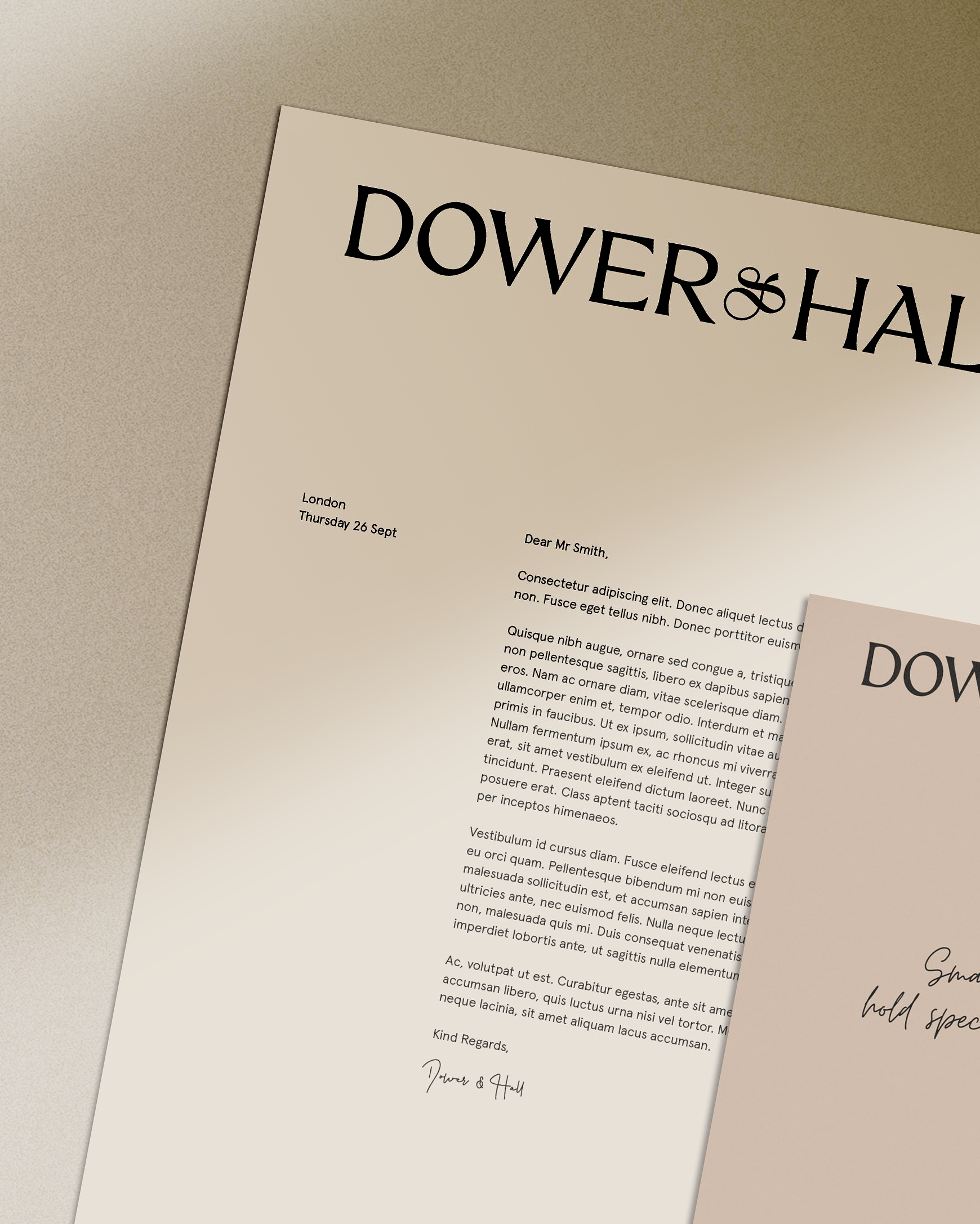
Dower & Hall’s new logotype has a more subtle and elegant look, with delicate and perfectly balanced letters.
The result is a more expressive logotype, furthering the brand’s personality, whilst bringing the brand forward toward a timeless design
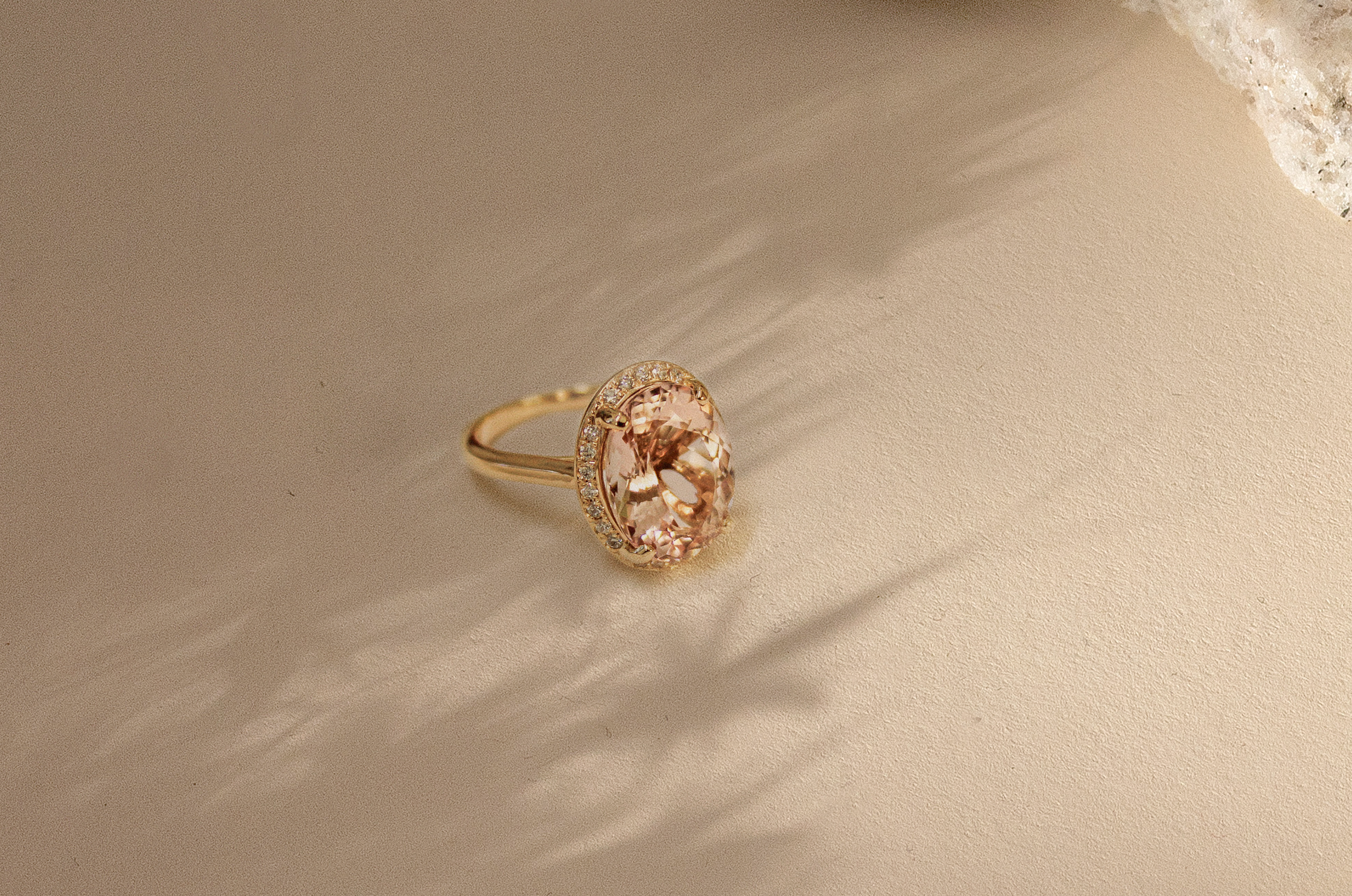
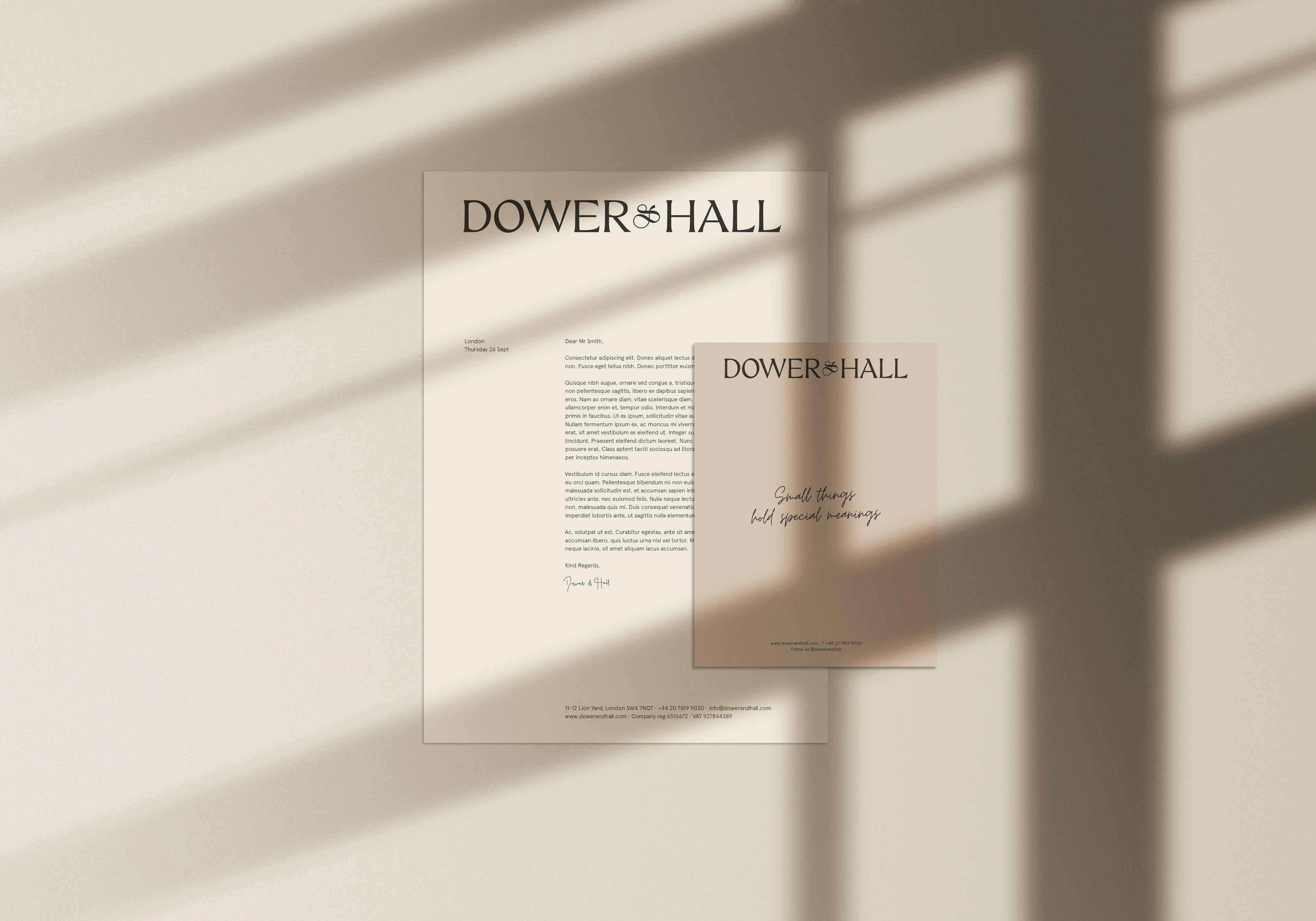
This new logotype dissociates itself from its “London” tagline. Timeless and elegant, the brand is not inspired by catwalk trends or marketed as “must-have” pieces, instead, it reaffirms its status with a fresh new look focusing on the brand personality.
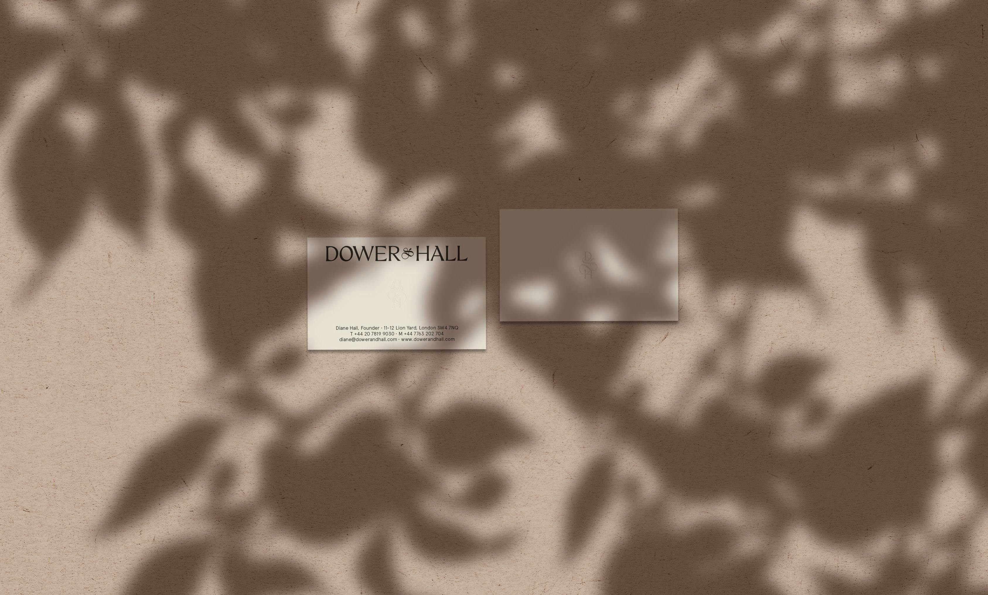
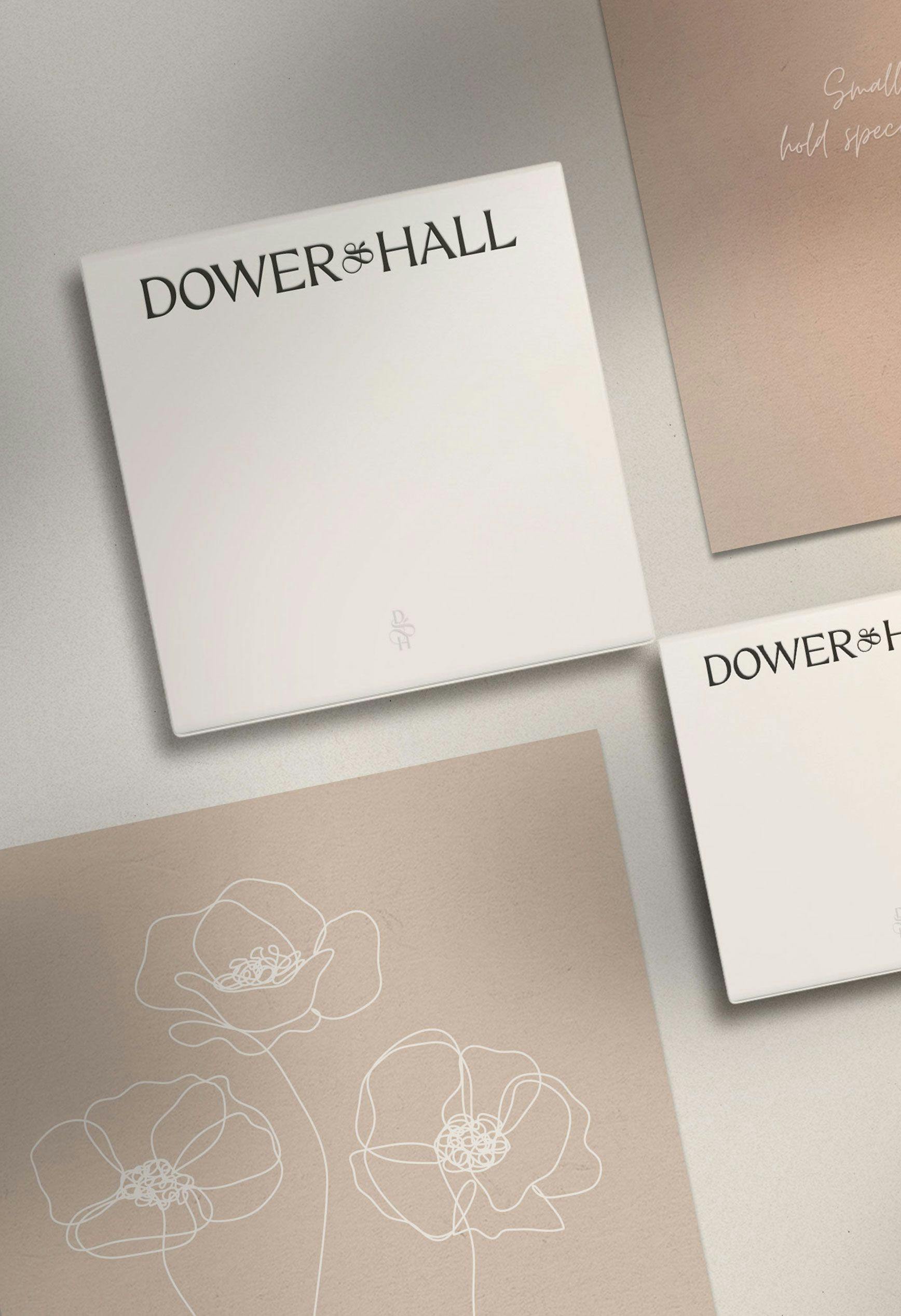
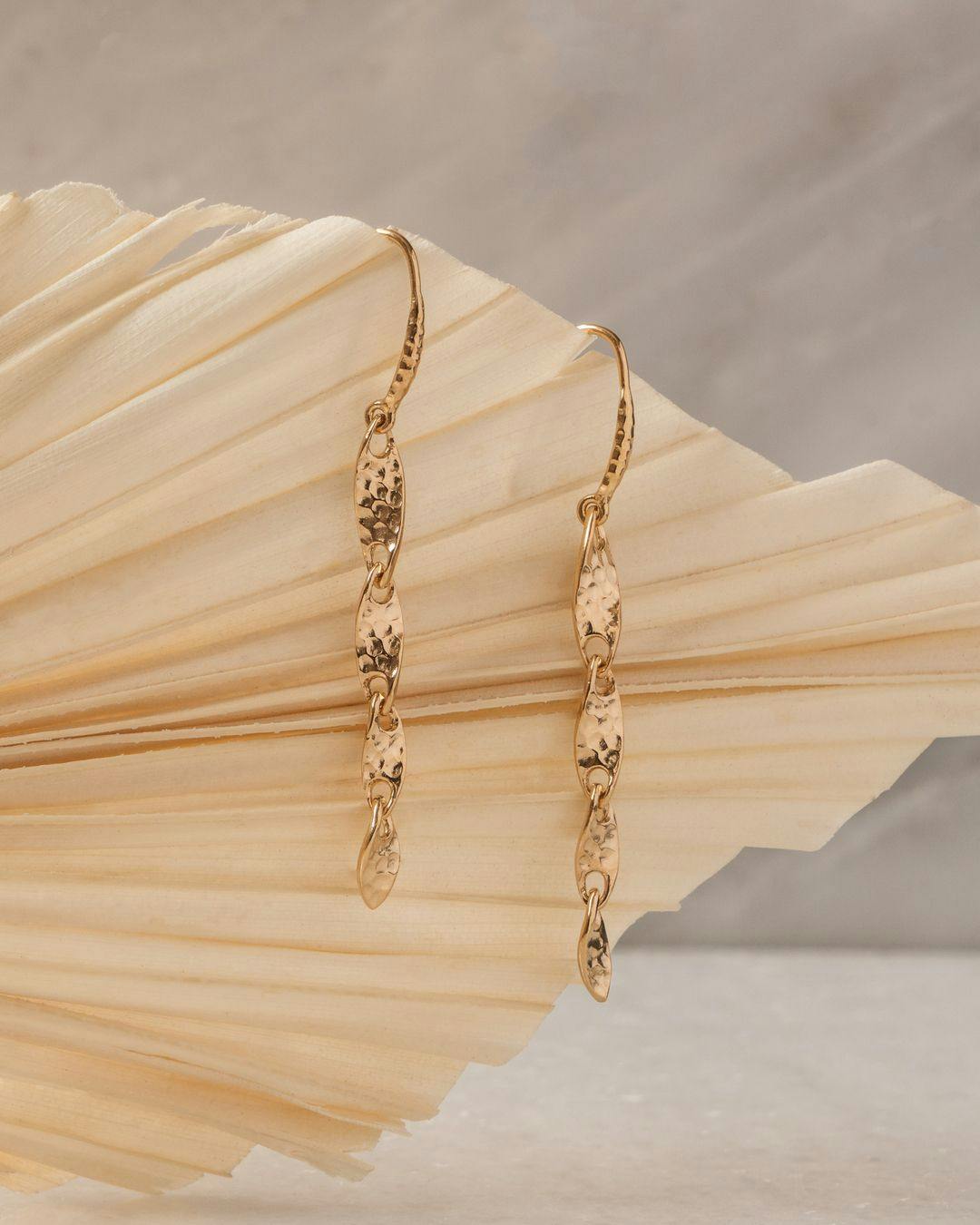
The new Dower & Hall monogram was created combining the characters “D&H” from the logotype to a distinctive ampersand, creating a single symbol — The simple oval stroke was inspired by natural shapes found in nature but also gemstones.
Timeless and considered, from classic earth tones to cool greys, we developed a neutral colour palette adding a sense of calm, maturity, and permanency to the brand.
Our Role: