Deskin's visual identity clearly and confidently aligns with the company's promises, helping people quickly identify what Deskin is and is not.
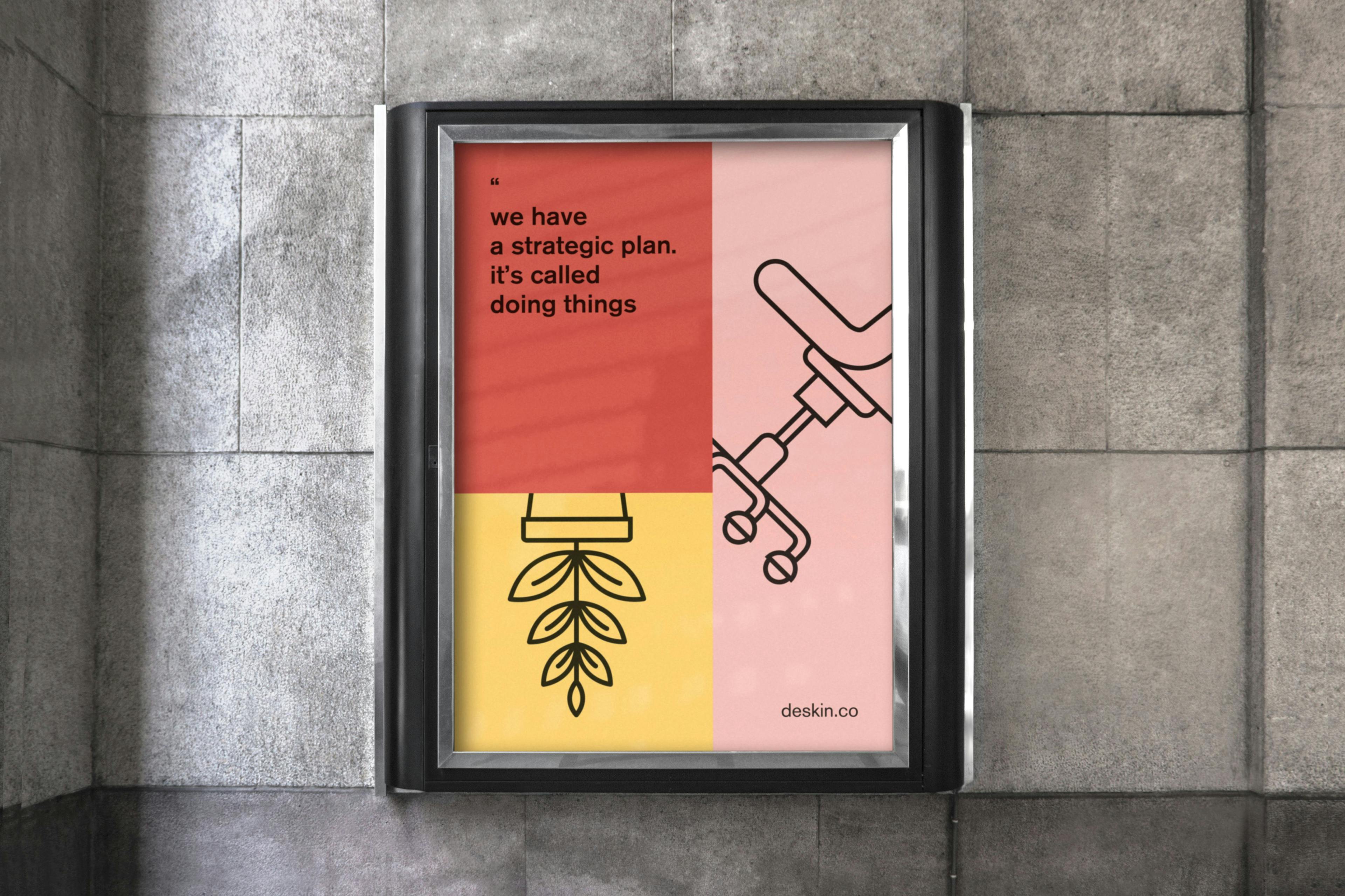
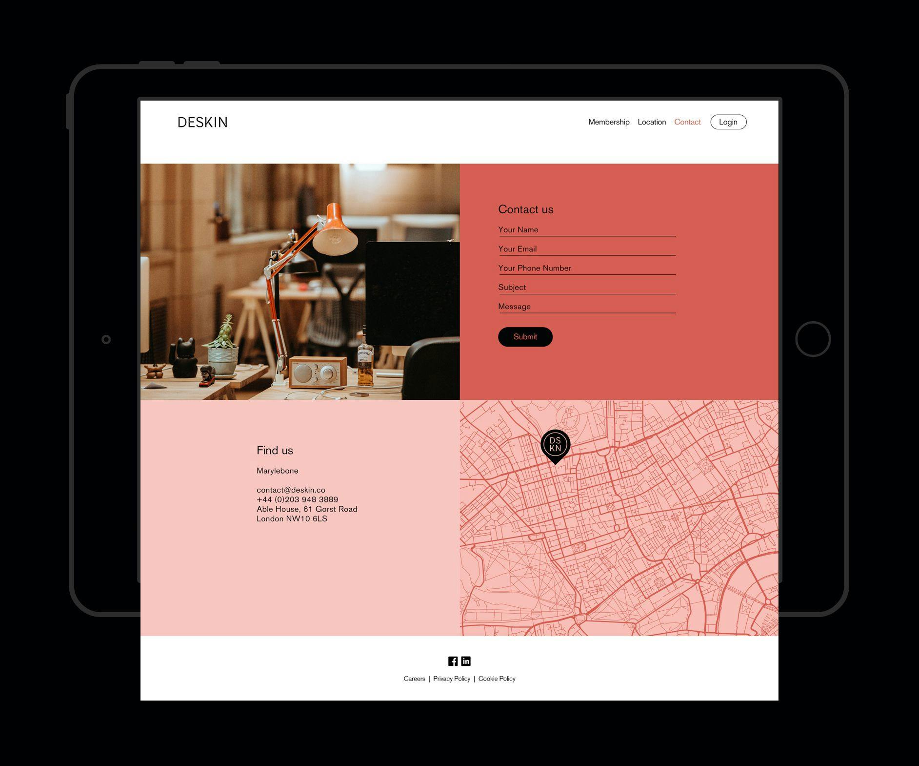
As a creative and innovative workspace located in a Marylebone mews, Deskin's brand identity needed to be bold, vibrant, and approachable. This newly set up co-working space is built to be comfortable and suitable for all businesses.
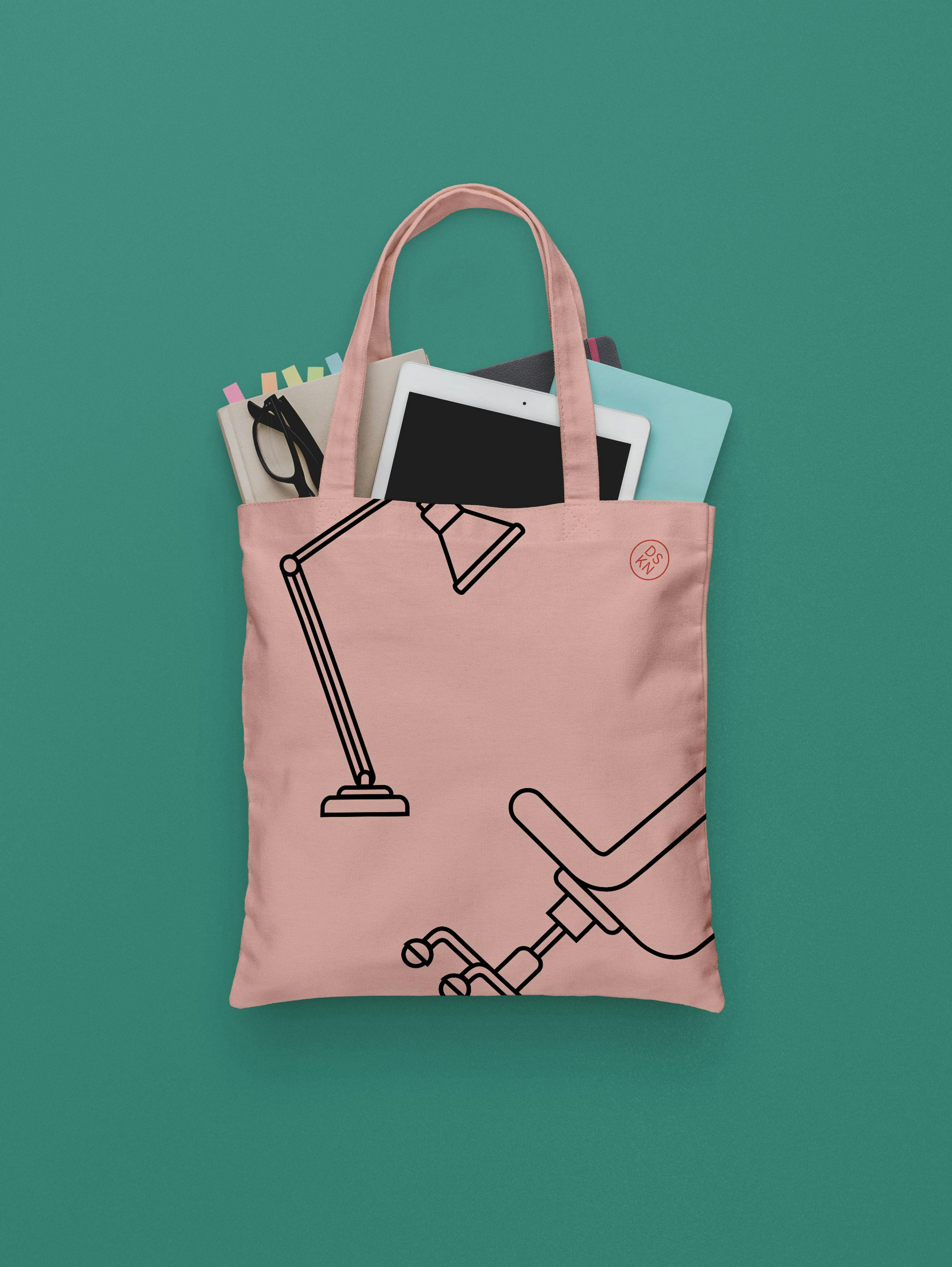
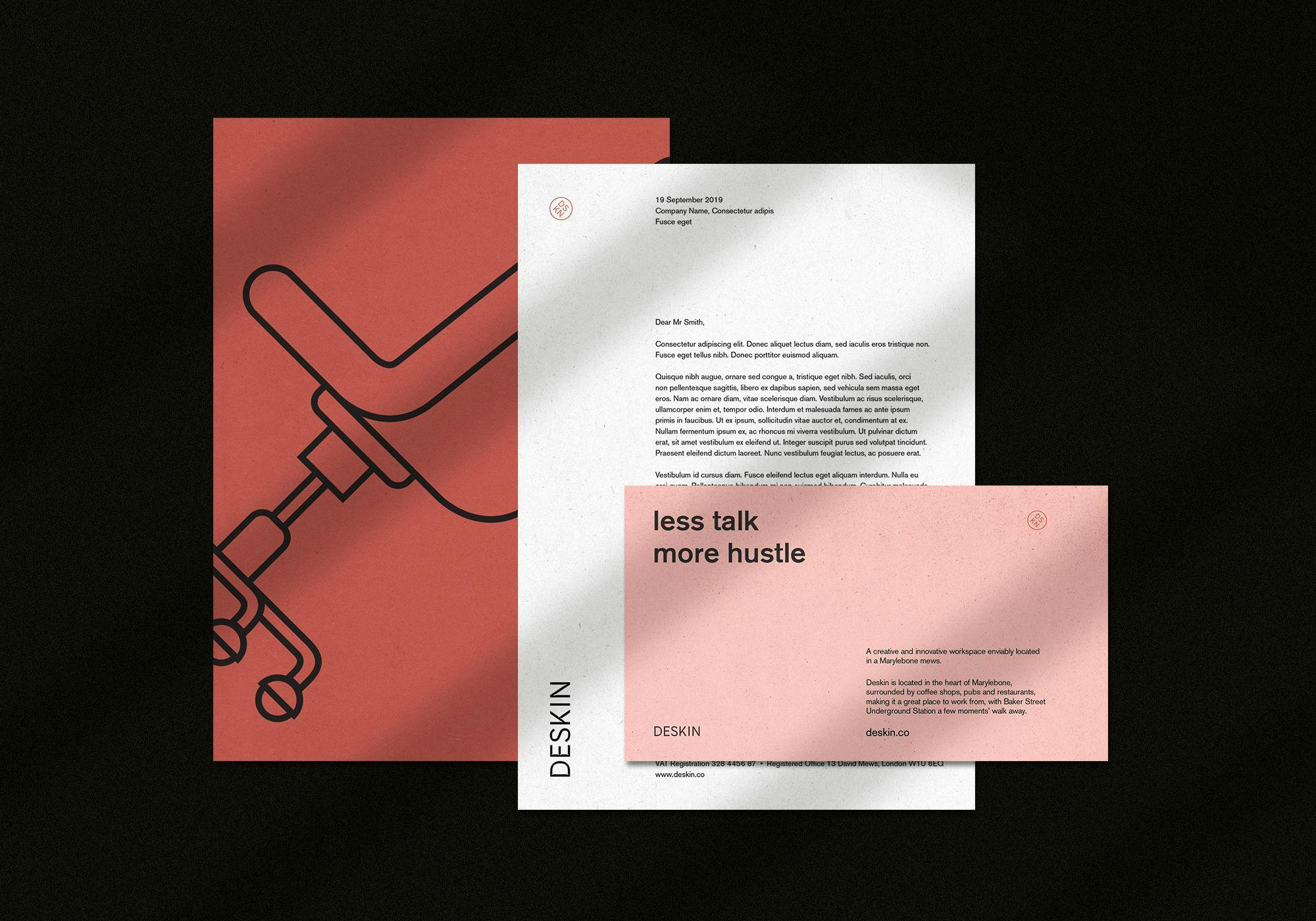
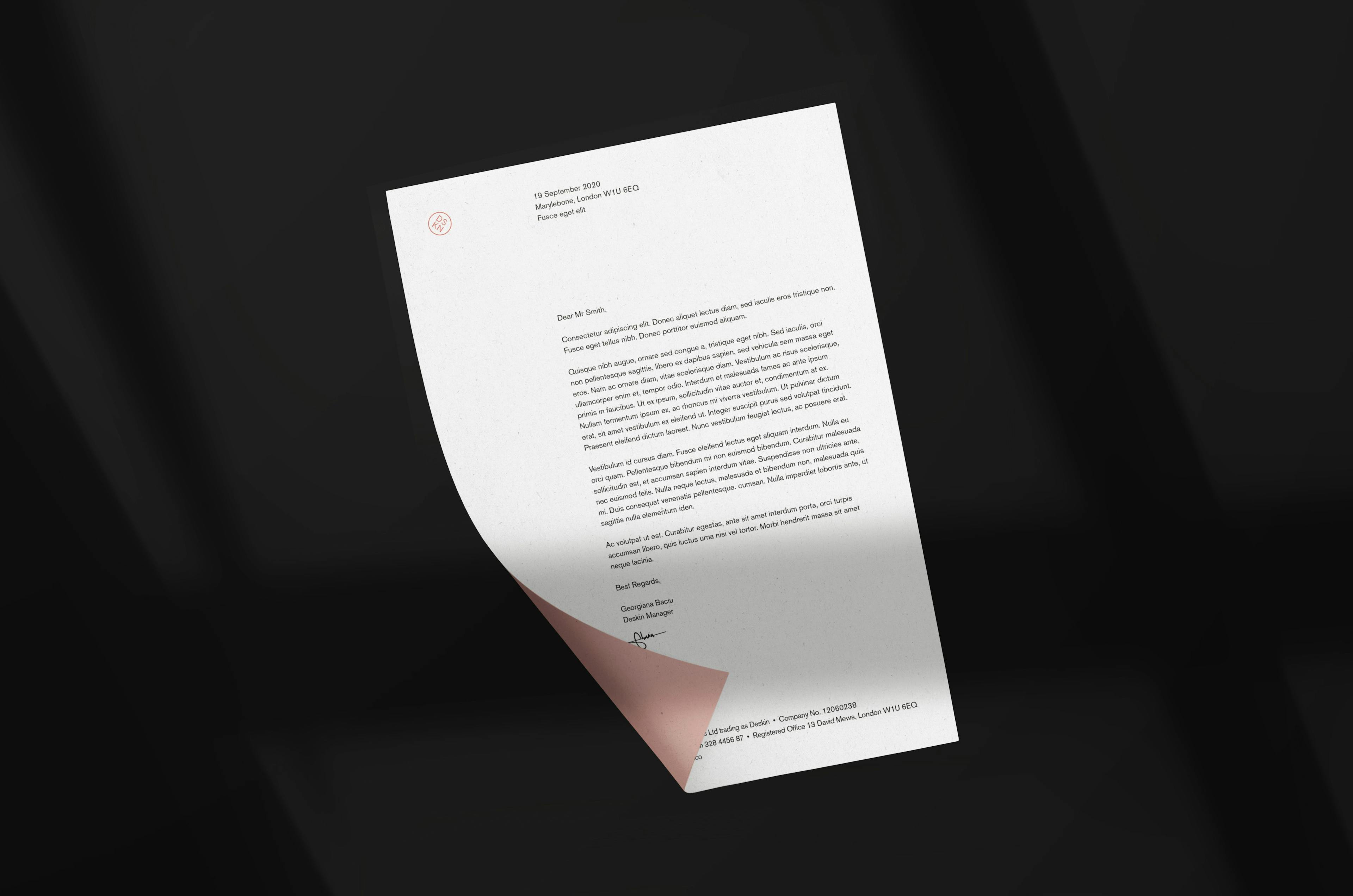
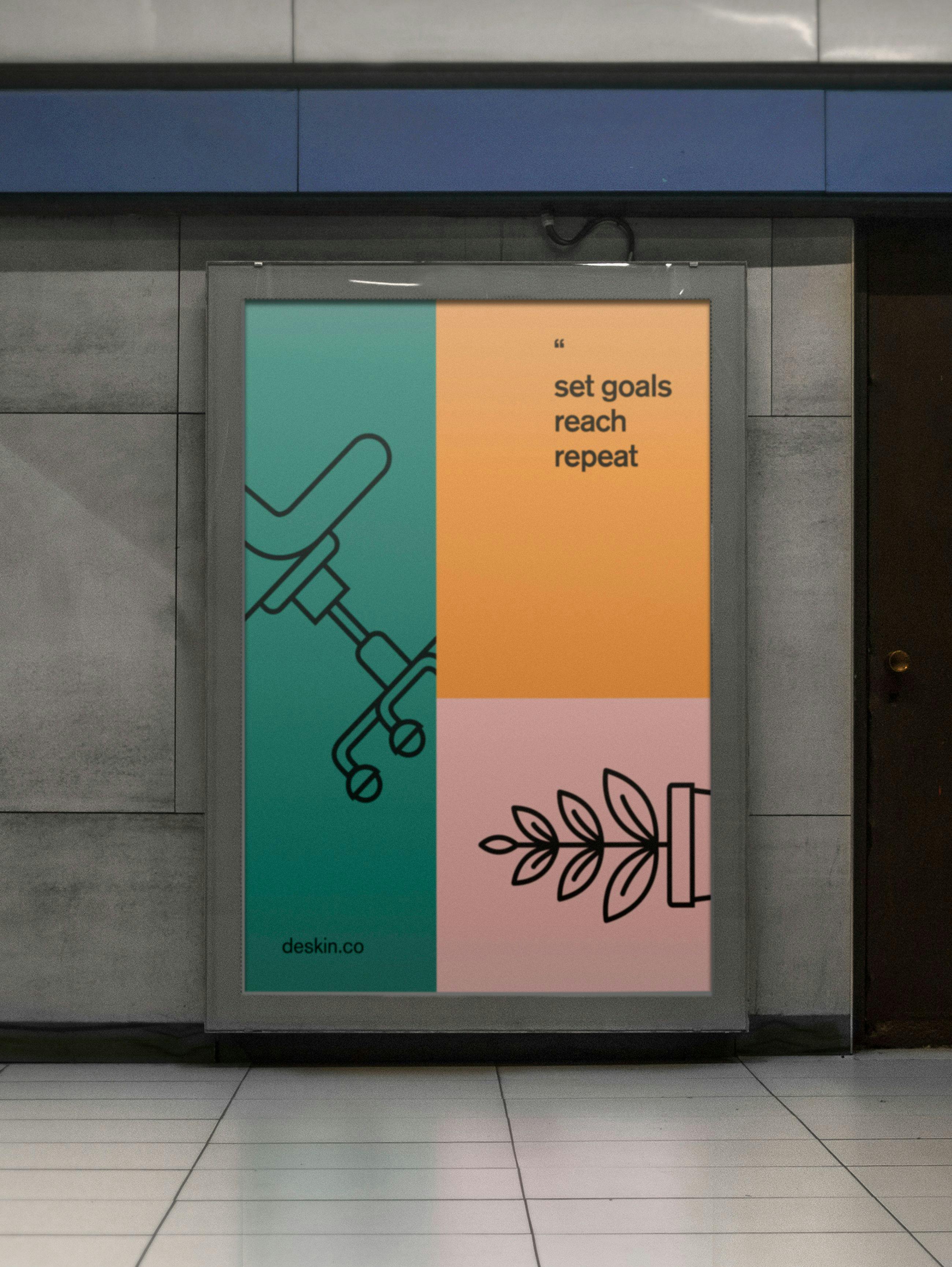
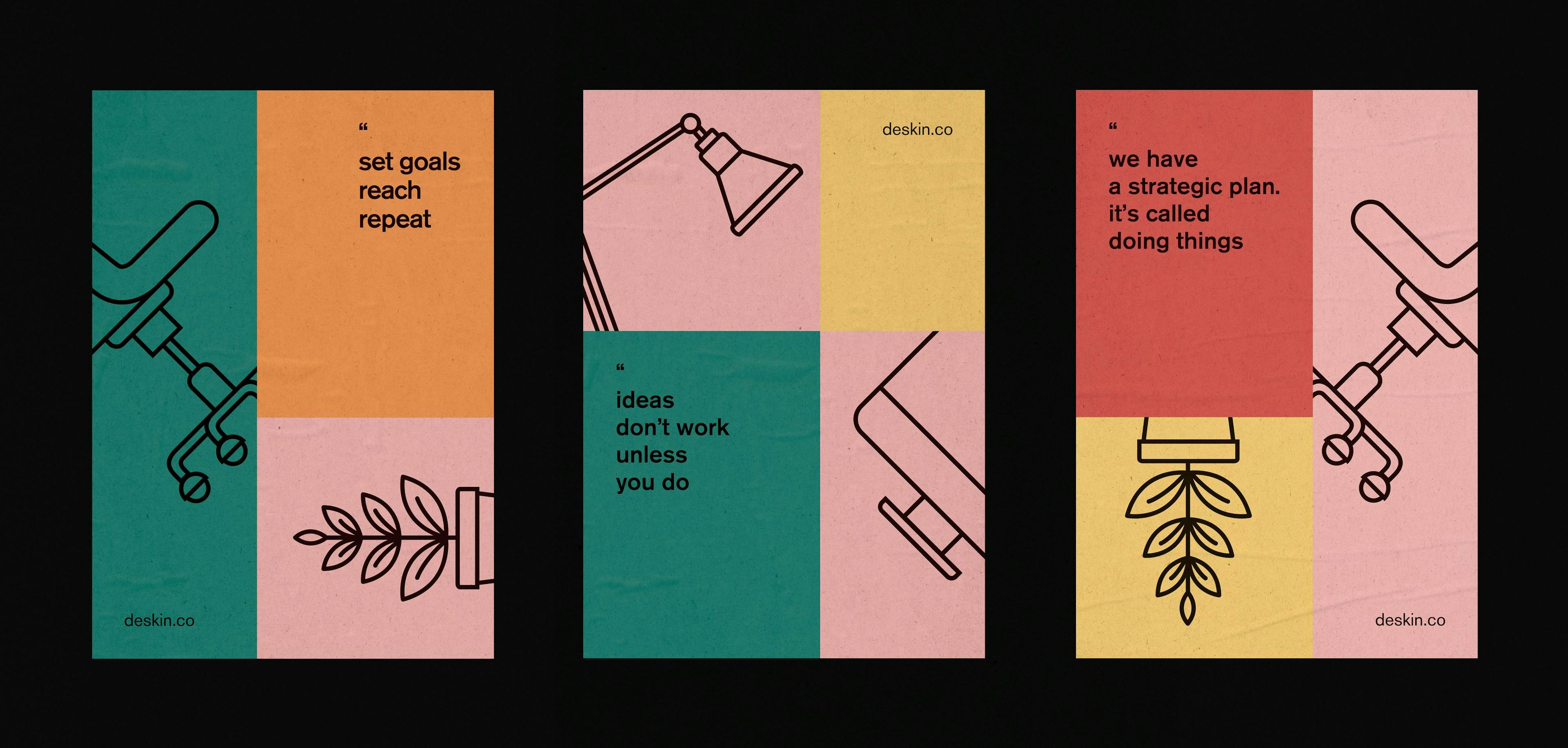
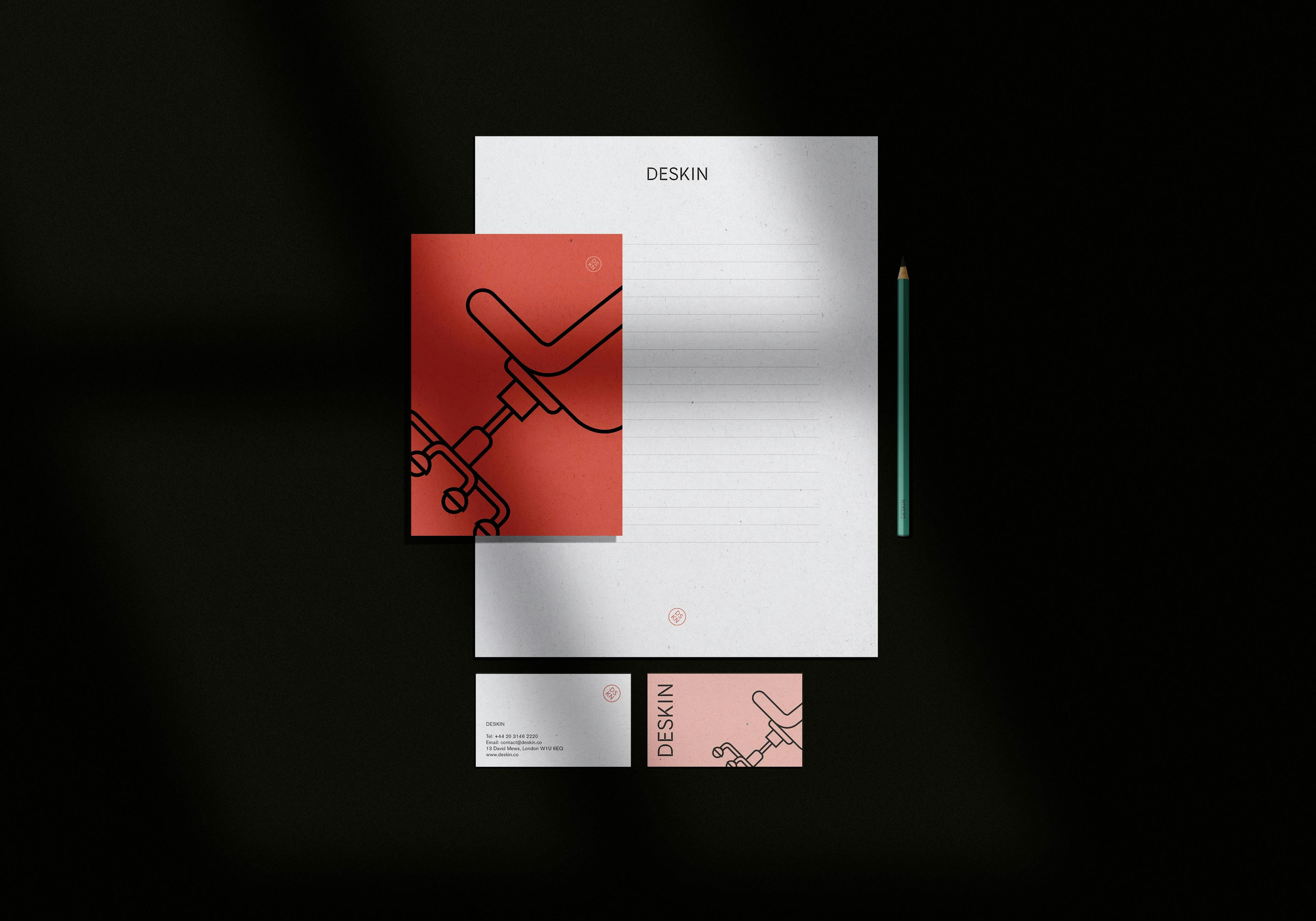
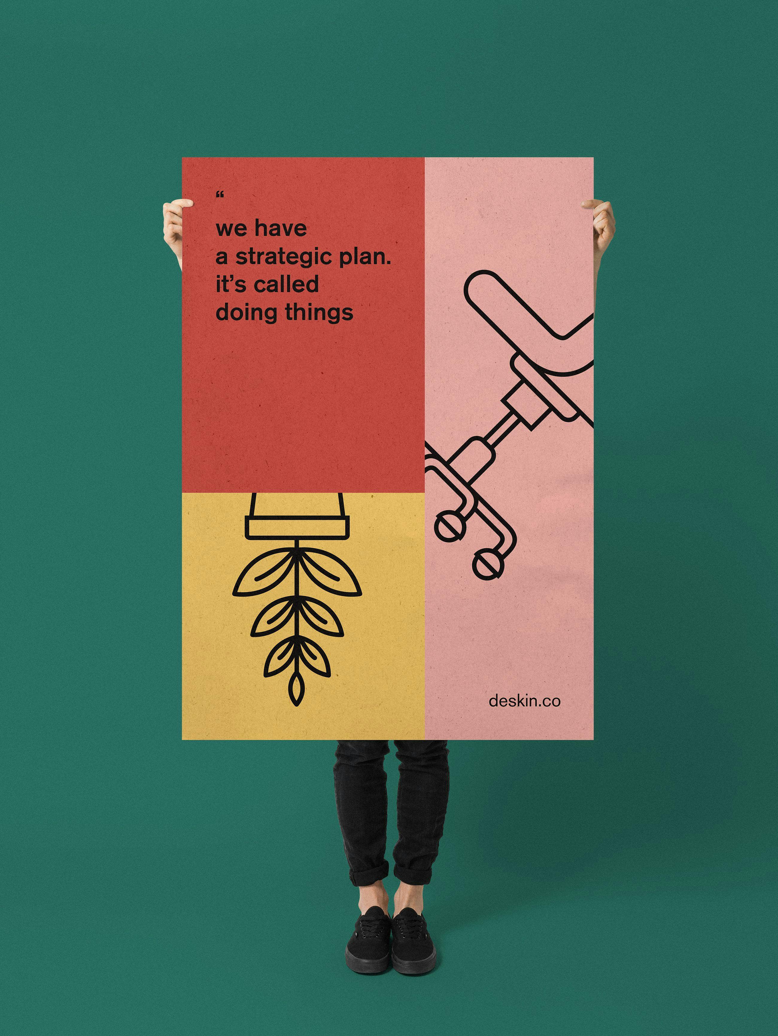
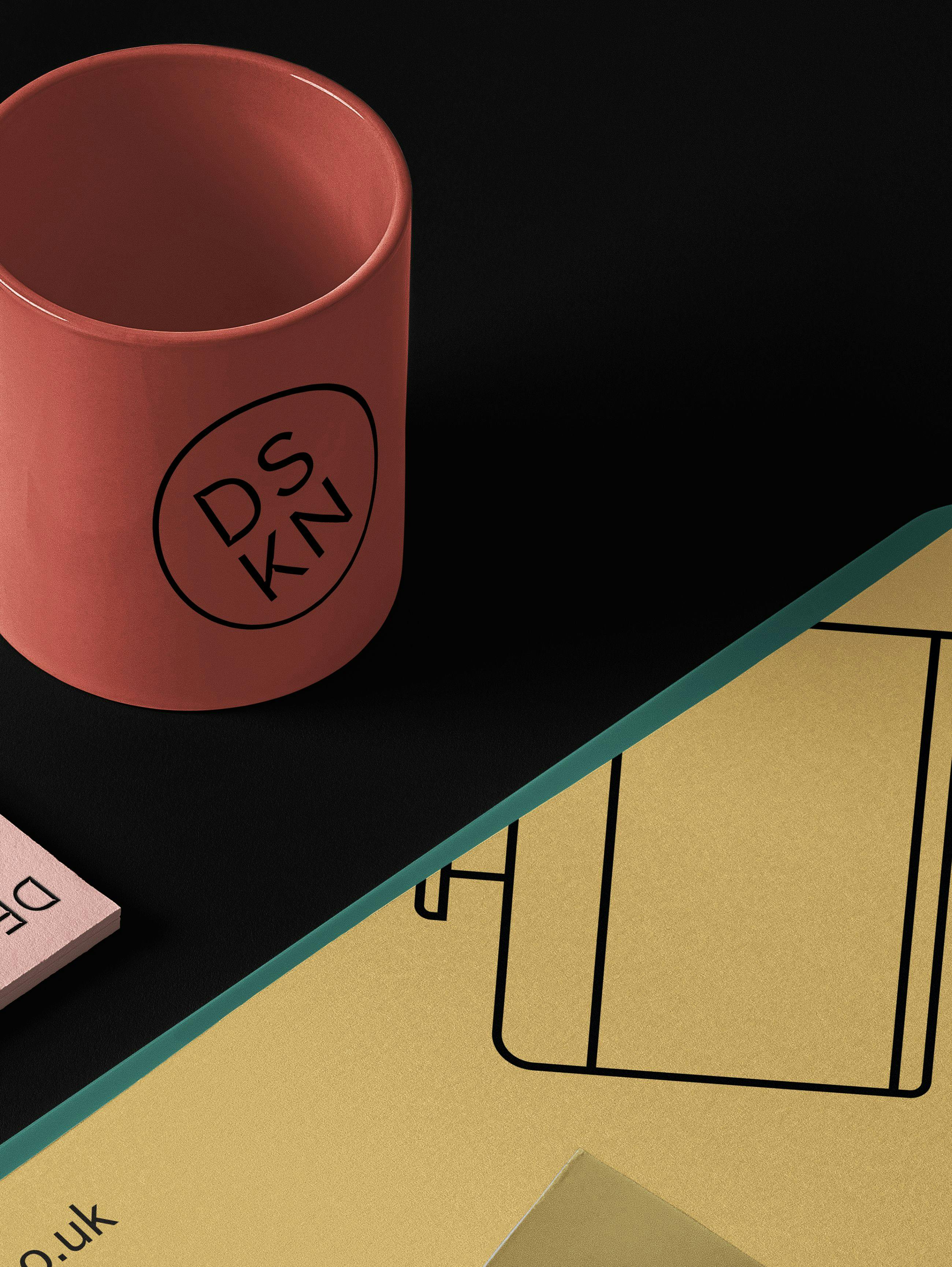
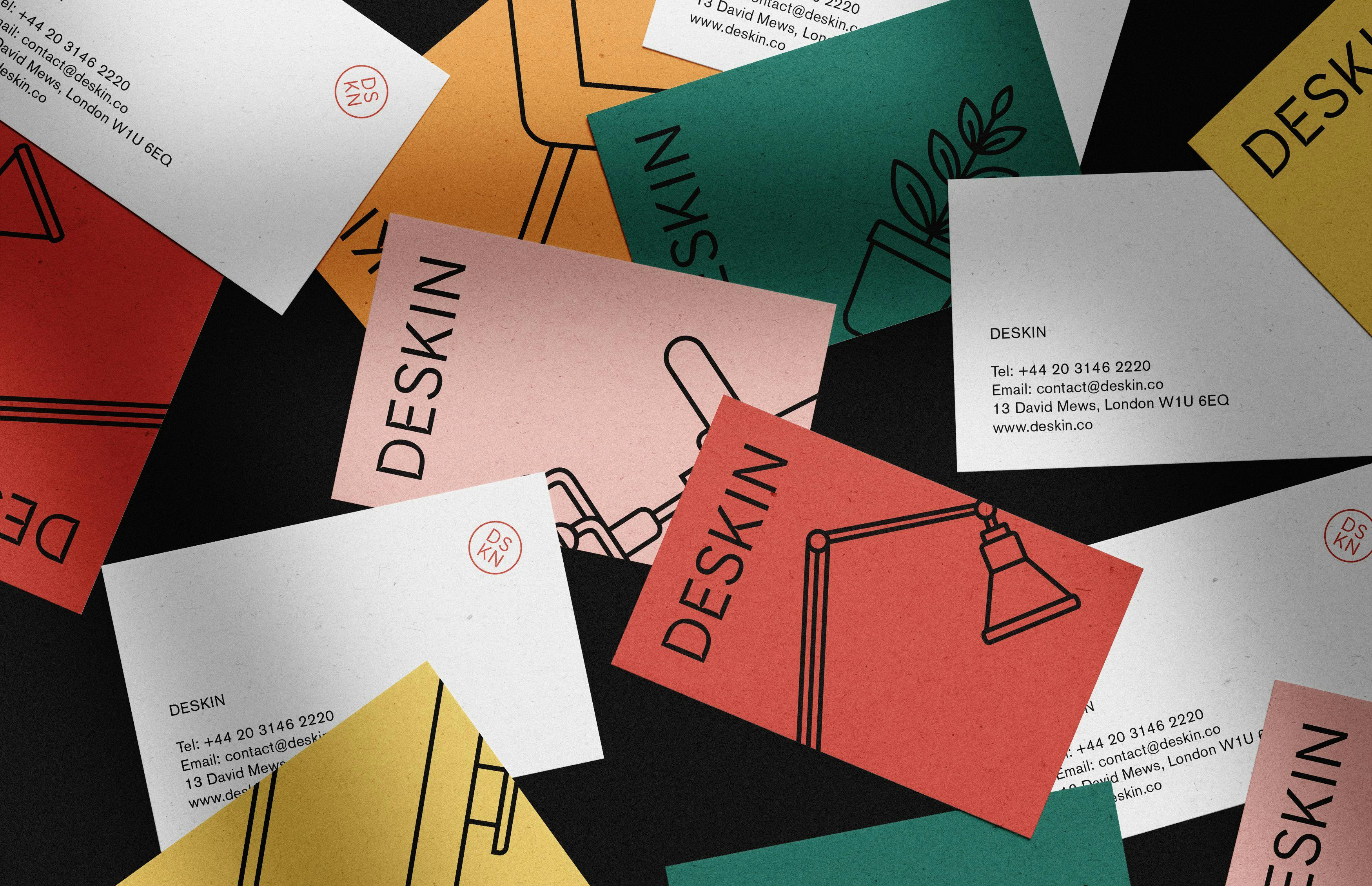
Deskin’s visual identity is built around a recognizable logotype with exaggerated ink traps, shortened descenders, and played squarish counters referring subtly to furniture shapes (desk legs, chairs, etc.). These details become obvious when you take a closer look, making the Deskin’s logotype unique. The bright and rich colour palette was inspired by the large variety of colours that can be foundin an office. Bespoke vector illustrations representing office furniture are used as key elements of Deskin new brand identity.
Our Role: